Volleyball is one of the defining sports of the fall season—fast-moving, intensely collaborative, and full of moments that deserve more than a quarter-page photo and a score column. Yet volleyball yearbook pages often get treated as afterthoughts: a few action shots squeezed alongside a roster grid, wrapped up in whatever space is left after football gets its ten-page spread. The result is a section that doesn’t capture the chemistry of a team that played together five nights a week for three months, or the seniors who anchored a lineup for four years.
Building a volleyball yearbook page that actually does the season justice takes intentional planning—the right photos, a layout that moves the eye naturally, copy that tells a story, and design choices that match the energy of the sport. Whether your yearbook staff is tackling this for the first time or looking to level up last year’s spread, this guide walks through every element.
Recognition That Lasts Beyond the Year
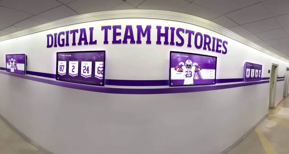
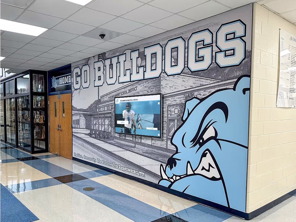
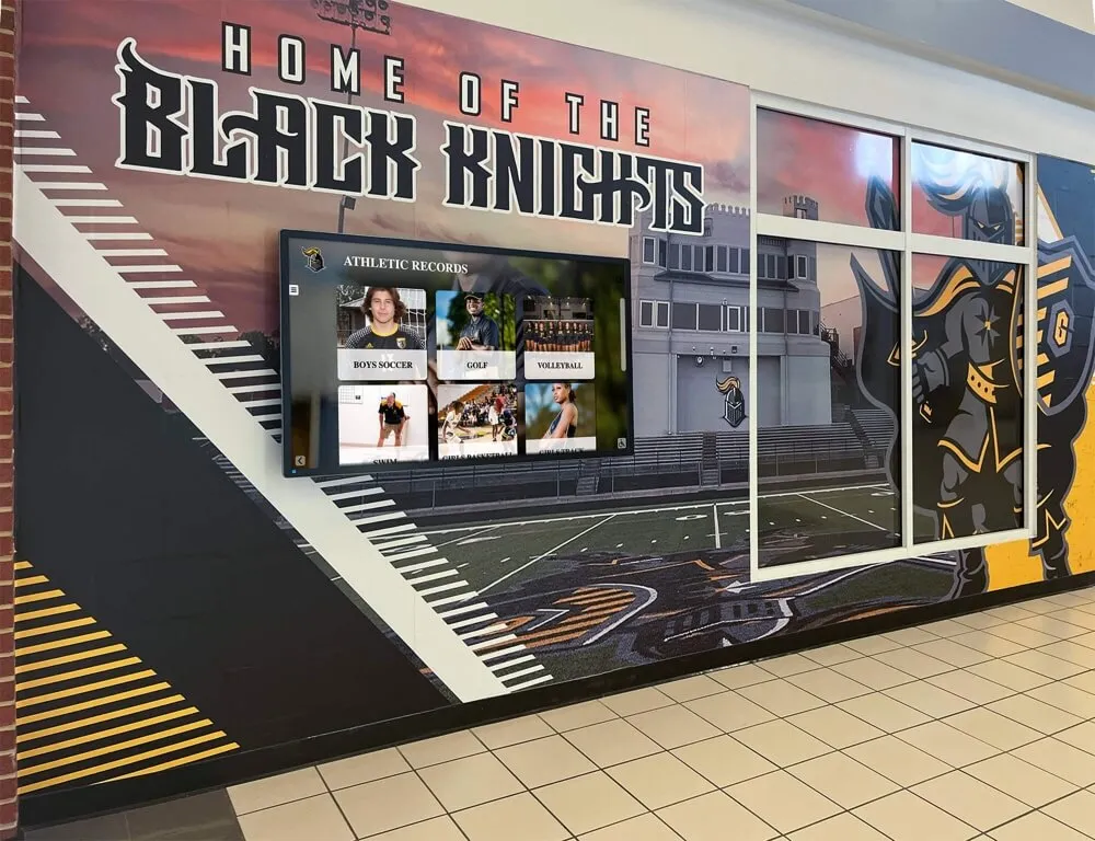
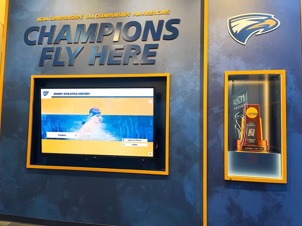
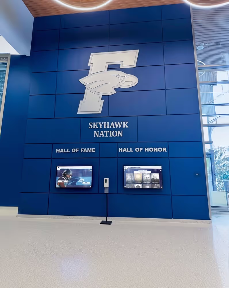
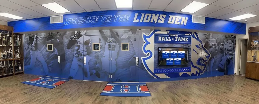
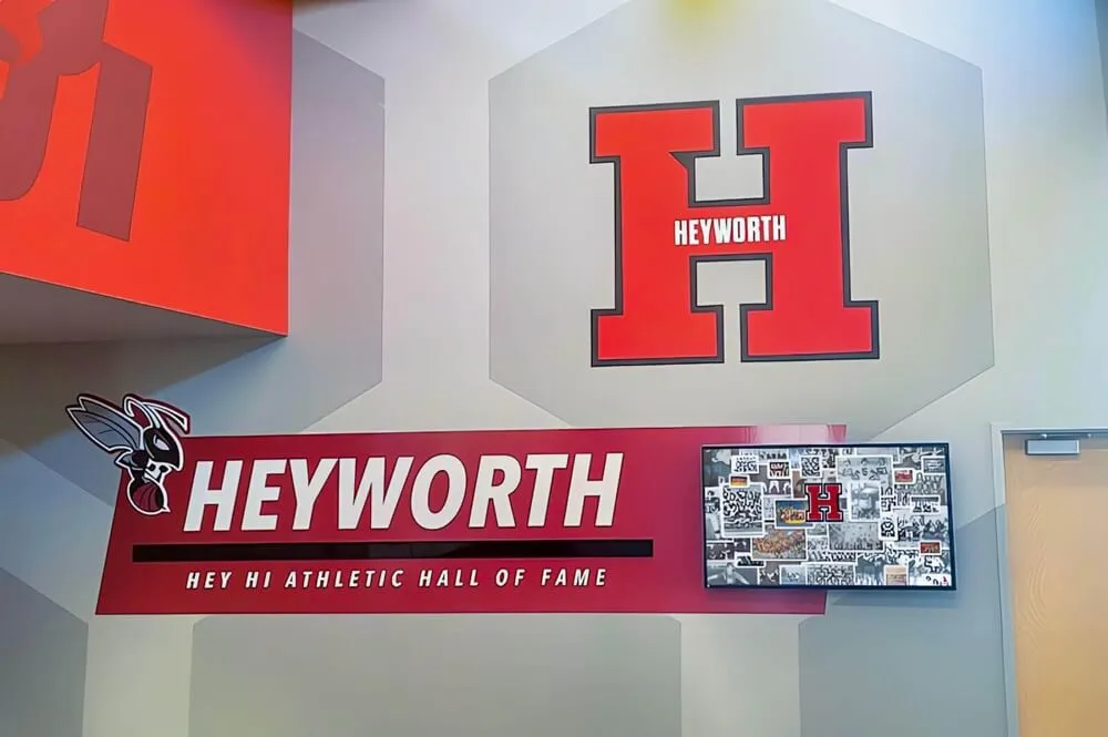
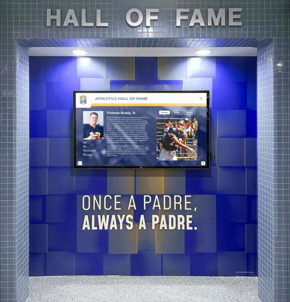
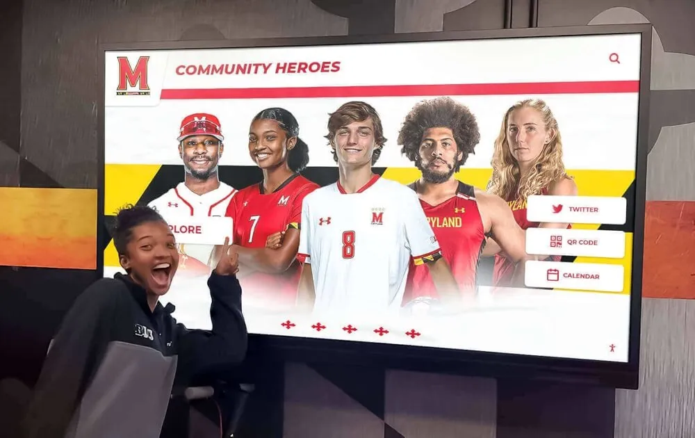
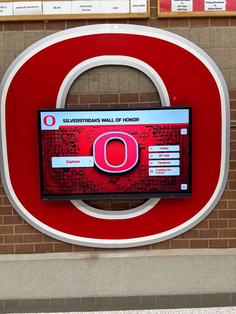
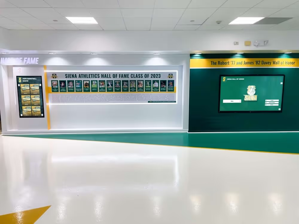
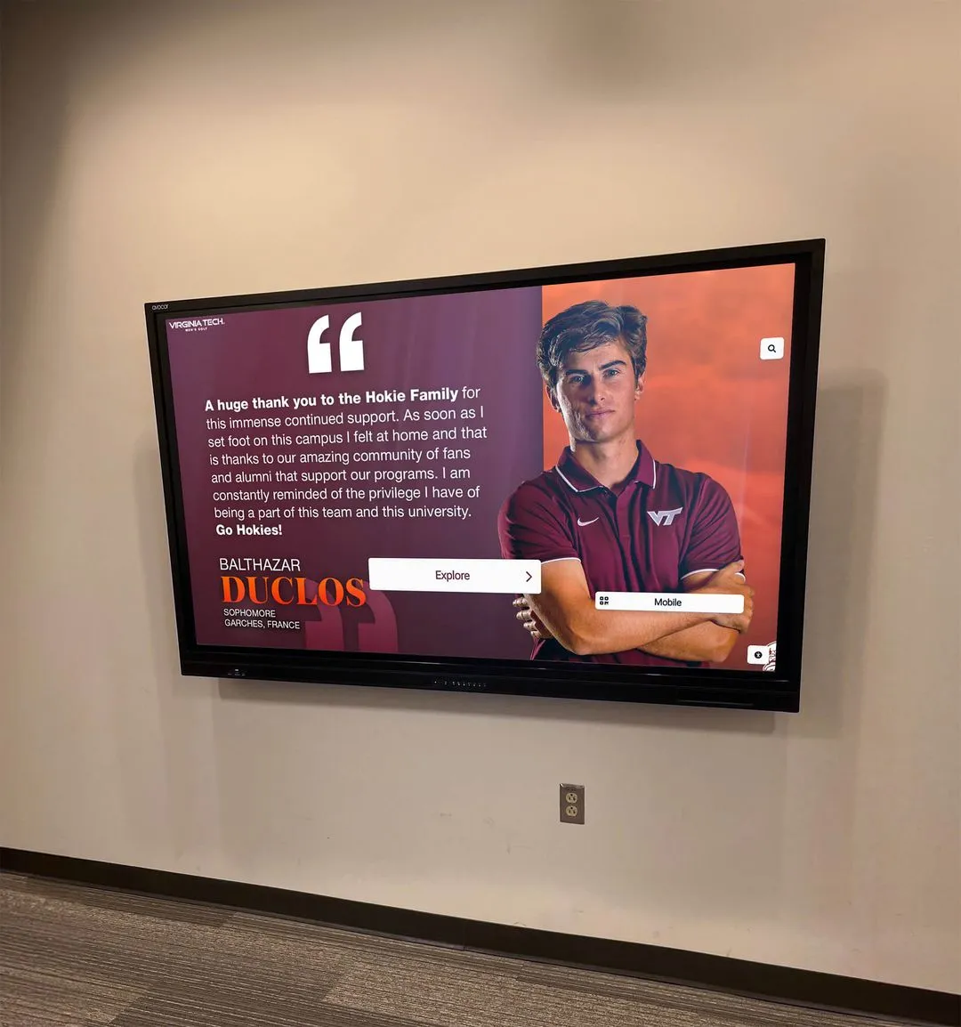
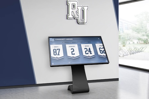
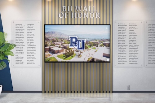
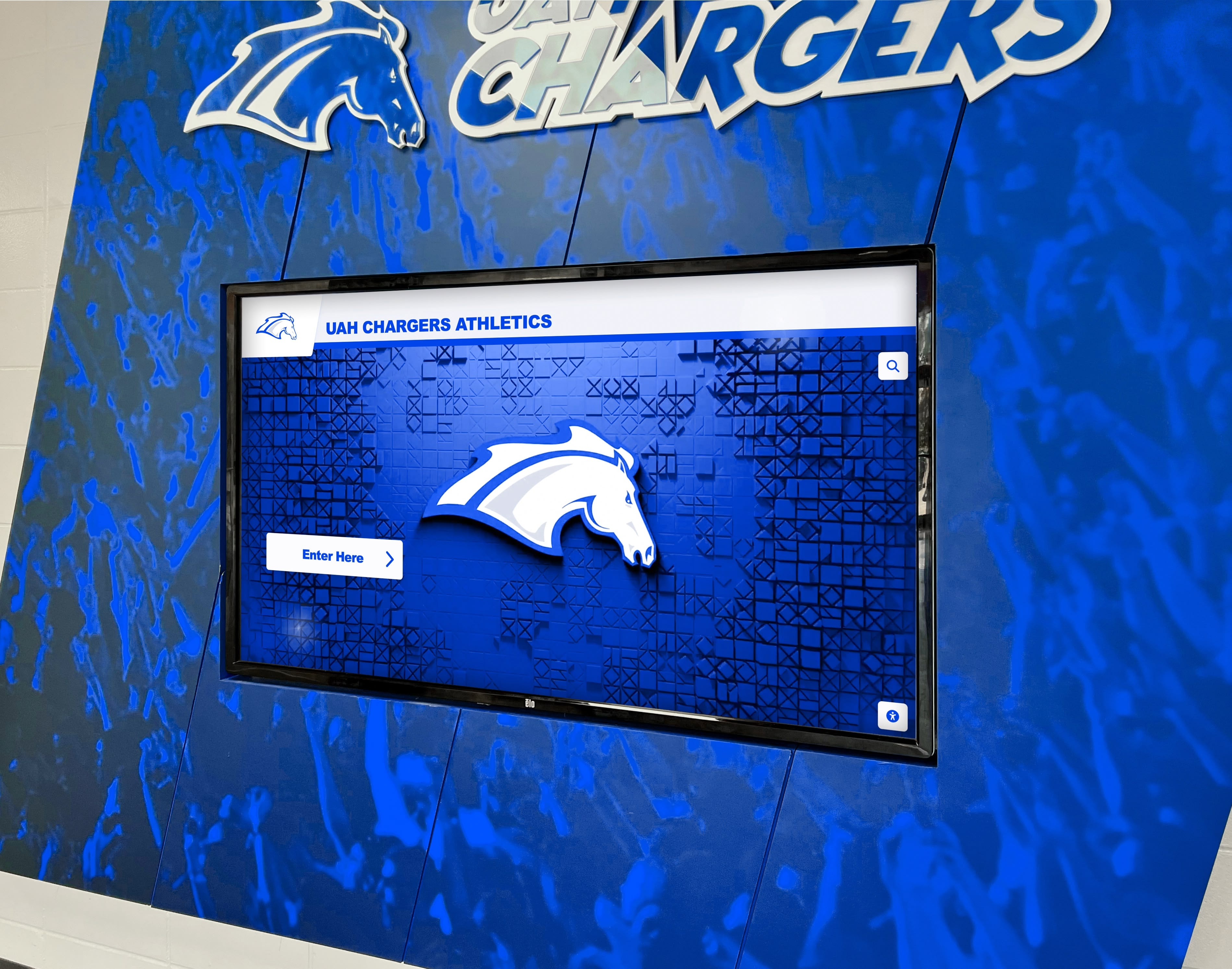
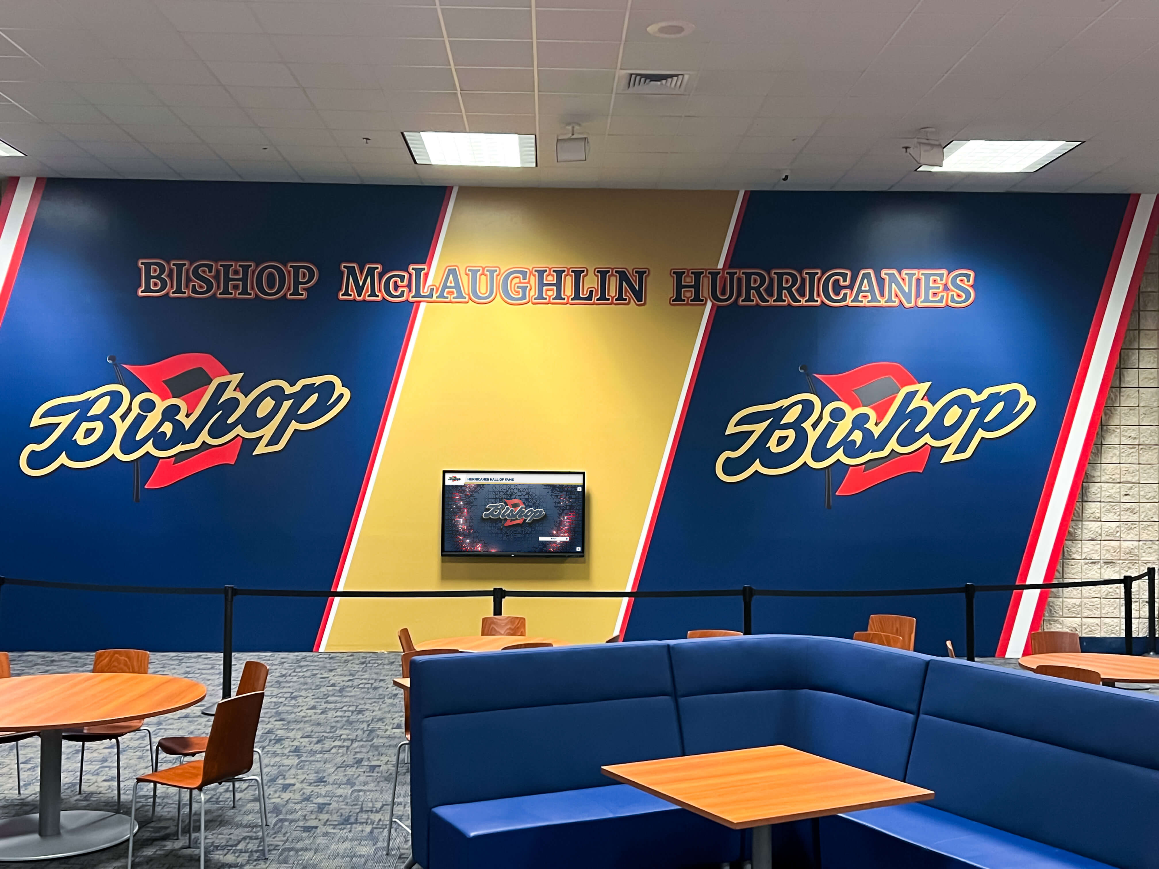
A well-designed volleyball yearbook page preserves a season in print. But many schools are now pairing their yearbooks with digital recognition platforms that let achievements live on in searchable, interactive formats accessible to players and families for years after graduation. Solutions like Rocket Alumni Solutions let athletic programs display season records, honor senior athletes, and build cumulative volleyball histories on touchscreen walls—extending the spirit of the yearbook into always-current recognition that updates automatically every season.
Why Volleyball Yearbook Pages Deserve More Space
Volleyball is a top-five participation sport in U.S. high schools and routinely generates some of the most dynamic action photography of any fall sport. Rally scoring means momentum can shift in seconds, creating dramatic moments across every set. Yet yearbooks frequently allocate it far less real estate than the sport earns relative to its participation numbers, fan attendance, and competitive depth.
The teams themselves notice. Seniors who spent hundreds of hours in preseason camps and practices flipping through a finished yearbook only to find a generic two-page spread with six photos feel the gap between effort and recognition acutely. Coaches who built a program over years sometimes find their volleyball section outclassed in size by clubs that competed in one tournament.
Getting the volleyball section right is partly a justice question and partly a design one. When the space matches the sport, the spread becomes one of the most visually compelling sections in the book—action photography provides natural energy, team photos offer genuine warmth, and there are usually enough individual stories to fill sidebar profiles and quotes throughout.

Planning Your Volleyball Spread Before the Season Starts
The biggest mistake yearbook staffs make with sports sections is starting too late. By the time the season ends, you’ve missed hundreds of photographs that would have made the spread, lost the chance to interview players during key moments, and forgotten which game produced the comeback everybody still talks about.
Assign Coverage Early
Designate a specific yearbook staffer—ideally one with some interest in volleyball—to cover the team from day one of preseason. That person should attend at least four to six matches across the season to build a variety of game situations, opponent types, and emotional moments. They should also attend one practice, which produces the candid teammate-interaction shots that action photography rarely captures.
Create a Shot List
Go into every match with a target list beyond “get some spikes.” A useful volleyball shot list includes:
- Service motion (full extension, ball contact)
- Dig recovery (low angle, defensive urgency)
- Block at the net (multiple players, height contrast)
- Setter hand position close-up
- Libero in serve-receive position
- Celebration between players after a point
- Bench reaction during a tense rally
- Coach instruction during a timeout
- Post-match handshake or celebration
A spread built from just these categories will have more visual variety than one built from whatever was captured without a plan.
Document the Season as It Happens
Keep a running log of match results, standout individual performances, and season milestones. When a player records her 1,000th career kill, that’s a profile moment. When the team wins a rivalry match that it had lost four years running, that’s a feature angle. These moments are obvious when they happen and easily forgotten by March.
Layout Ideas for a Volleyball Yearbook Page
A strong volleyball spread typically runs two to four pages depending on how your book allocates sports coverage. Here are approaches that work well at each page count.
Two-Page Spreads
Two pages is the minimum for doing volleyball justice. The most common mistake at this size is trying to fit too much—roster grid, team photo, action shots, and individual stats all competing for space. A focused approach works better.
Option 1: Anchor on one hero image. Use a large (half-page or larger) action photo as the visual anchor, then build remaining content around it. Two to three supporting photos at smaller sizes, a brief season narrative paragraph, final record, and a roster list give complete coverage without visual chaos.
Option 2: Modular grid. Divide the spread into a consistent grid of six to eight photo panels, each roughly equal in size, with captions and a pull quote positioned in a break between panels. This approach works when you have strong photography across multiple games and want to show the season’s breadth.
Option 3: Stats-forward. Lead with a season statistics sidebar and let numbers drive the visual hierarchy. This approach works well for programs that had measurable breakout years or record-setting individuals—highlight the numbers first, then support them visually.
Four-Page Spreads
Four pages gives you room to tell a real story. Treat it as two two-page spreads, each with a different angle: the first focused on the team and season narrative, the second on individual spotlights, senior recognition, and program milestones.
A practical four-page structure:
- Page 1-2: Full-team photo, season narrative, match results, and three to four action images
- Page 3: Senior feature block with individual photos and quotes
- Page 4: Season statistics, awards received, and a coach’s corner quote or reflection
For schools that want a richer template library, resources like elementary school yearbook cover ideas from Rocket Graphics offer design inspiration applicable to sports spreads as well.

Photography That Makes Volleyball Pages Come Alive
Volleyball photography has specific technical demands. Games are played in gyms under artificial lighting, with fast movement that requires faster shutter speeds than most natural-light situations.
Camera Settings for Indoor Action
Even with a basic DSLR or mirrorless camera, a few settings adjustments significantly improve results:
- Shutter speed: 1/500s or faster to freeze motion during spikes and blocks
- ISO: Raise to 1600–3200 as needed for gym lighting—modern cameras handle this well
- Continuous autofocus: Track the ball or the primary player through the motion
- Burst mode: Shoot a sequence on each rally and select the best frame during editing
Shooting Angles That Work
Low angle from the sideline baseline produces the most dramatic spike and serve photographs, showing the gym ceiling and opposing players in the background, giving a sense of scale and competition.
Elevation from the bleachers or a step ladder gives a better angle for showing the full play—multiple players, net interaction, court spacing—that makes the game dynamics legible.
Behind the bench captures coaching moments, player substitutions, and the emotional arc of close matches without interfering with play.
What to Edit Out
Quality over quantity is important in sports photo selection. In the editing pass, cut any image where:
- Motion blur makes the subject unclear
- The key player’s face is hidden or turned away
- The gym background includes distracting elements (open doors, bystanders in the aisle)
- Lighting creates harsh shadows across faces
A spread with eight technically strong photos outperforms one with twenty mediocre ones every time.
Writing Volleyball Yearbook Copy That Tells the Story
Design draws the reader in; copy makes the spread memorable. The writing on a volleyball page should cover three things: what happened this season, who mattered, and what it felt like to be on this team.
The Season Narrative
The main body copy (usually 150–250 words for a two-page spread) should treat the season as a narrative arc. A useful structure:
- Opening moment: Start with a specific game, play, or turning point—not “The 2025 volleyball team had an exciting season.”
- Season context: What was the team’s record, what conference did they compete in, and what were the key storylines (rebuilding year, senior-led championship run, comeback from a losing start)?
- Defining match or moment: Identify one match that defined the season and describe it in a sentence or two.
- Looking ahead: Close with a line acknowledging what the team built and who returns.
Captions That Add Information
Captions on sports pages too often just repeat what you can see: “Junior Maya Torres spikes the ball.” Good captions add context the photograph can’t show: “Junior Maya Torres, who led the team with 187 kills on the season, converts the match point against Jefferson in the regional semifinals.”
Every caption should include the player’s name, class year, and one piece of information that extends beyond the visual.
Pull Quotes
One strong pull quote per spread—from a player, coach, or both—adds an authentic voice that body copy can’t replicate. Pull quotes should reflect something specific about the team’s experience, not generic sentiments. “We worked harder than any team I’ve been on” could apply to any team anywhere. “We came into regionals as a six seed and none of us thought that mattered” is something only this team could say.
Highlighting Individual Players: Profiles and Senior Spotlights
Individual recognition is where volleyball yearbook pages often have the most impact on players and families. A player whose senior season gets a dedicated profile will remember that spread for decades.
What to Include in a Player Profile
For featured players—typically seniors or varsity starters with significant season contributions—a good profile block includes:
- Headshot or candid portrait distinct from the team photo
- Stat line: key season statistics relevant to their position (kills/attempts for outside hitters, assists and service aces for setters, digs for liberos)
- Years on varsity: context for their program contribution
- Quote from the player about the season or their volleyball experience
- Brief bio note: future plans, other activities, or unique angle on their story
Profile blocks work best at a consistent size so the page reads as a cohesive unit rather than a series of differently-scaled elements.
Senior Recognition
Seniors deserve special emphasis on sports spreads. Options beyond standard profile blocks include:
- Senior superlative categories specific to volleyball: “Best Hands,” “Most Likely to Dive for a Ball Out of Bounds,” “Team Hype Person,” “Future Coach.” Resources like creative yearbook senior superlatives offer category ideas that apply well to athletic pages
- First and last photo comparison: A brief “freshman year to senior year” side-by-side if you have access to archival photos
- Stat cumulative totals: Career kill count, sets played, or other milestones that show program longevity
For seniors who are continuing to play at the college level, a brief note about their commitment adds a forward-looking element to the page. Schools tracking college recruits often find resources on getting recruited for college volleyball useful for understanding what programs and statistics matter.
Recognizing Coaches and Staff
Coaches are often invisible in sports spreads despite being central to team culture, development, and success. Volleyball yearbook pages that include coaches well demonstrate a broader understanding of what makes a program function.
Head coach recognition should include a photo (action coaching shot is more engaging than a posed portrait), a brief quote about the season or the team, and their current record or tenure note if it’s a milestone year.
Assistant coaches, junior varsity coaches, and volunteer coordinators also deserve mention. A brief “staff” sidebar listing names and roles takes minimal space and sends an important message about who the program acknowledges.
For a deeper look at how coaches and support staff can be recognized across school recognition contexts, see this guide on teacher and coach recognition.
Season Statistics: Making Numbers Visual on the Volleyball Page
Statistics tell the season’s story in a different register than narrative and photography. A well-formatted stats block makes a volleyball spread feel complete and provides a reference that players and families will return to long after graduation.
What Stats to Feature
For a typical high school volleyball program, the most meaningful individual statistics to feature include:
- Kills and kill percentage (offense)
- Service aces and service errors (serving)
- Assists (setters)
- Digs (defensive specialists and liberos)
- Blocks (middle blockers)
Team statistics to display include overall record (with conference/non-conference breakdown), sets played versus sets won, team kill total, and team dig total.
Formatting Options
A two-column stat table is the cleanest format for sports page statistics—player name on the left, statistic on the right, sorted by value. Using school colors for the header row and alternating light/dark row shading makes the table readable without requiring extra graphic elements.
Bar charts or icon-based infographics can work if your yearbook has a strong graphic design team, but they require more production time and are easier to get wrong. A clean table is always preferable to a cluttered infographic.
For schools that have strong athletic record-keeping programs, resources on software tools for athletic administrators cover platforms that track this data automatically across sports.
Color, Typography, and Design Elements for Volleyball Spreads
Visual design choices anchor the spread in your school’s identity while giving volleyball its own personality within the yearbook.
Color Palette
School colors are the foundation. For volleyball spreads specifically, consider:
- High contrast between background and foreground elements—volleyball photography tends toward dark gym backgrounds, so light-colored text overlays can wash out against photos
- One accent color beyond your school colors for callout boxes, pull quote borders, or stat header rows—this prevents the spread from looking identical to every other sports section
- Consistent use of white space—crowded spreads feel like the staff ran out of time; purposeful white space signals confidence in the content you chose to include
Typography
Volleyball is a dynamic, quick sport—typography should reflect that energy without becoming illegible:
- Use a bold, condensed font for section headers and stat labels
- Keep body copy in a readable serif or clean sans-serif at 9–11pt
- Pull quotes benefit from large leading (line spacing) to create visual breathing room even when the quote is brief
Graphic Accents That Work for Volleyball
- Net line graphic as a divider between sections
- Volleyball silhouette as a watermark or background element
- Score ticker style number displays for season record
- Jersey number badges next to player profile names
Avoid overusing graphic elements—one or two consistent accents throughout the spread create cohesion; five different graphic styles create visual noise.
Covering the Full Volleyball Program: JV and Freshman Teams
Many yearbooks cover only varsity, which leaves out the majority of students who played volleyball that year. If your book has the page count, JV and freshman volleyball spreads deserve their own pages—shorter versions are fine, but complete absence isn’t.
For JV and freshman pages, a single two-page spread with team photo, brief season narrative, record, and roster works well. Action photography is harder to get from JV matches so don’t force it—a strong team photo with well-written copy serves better than action shots taken under difficult conditions.
Fall high school sports guide resources provide broader context on the depth of fall athletic programs that yearbook staffs should be capturing across all competitive levels.
Seasonal Milestones Worth Featuring
Certain moments and achievements belong on any well-constructed volleyball yearbook page regardless of the season’s final record. Look for:
- First win of the season if it came after a difficult start
- Rivalry match result especially if it broke a multi-year losing streak
- Senior night ceremony and recognitions
- Conference title or conference tournament results
- State playoff appearances with bracket path documentation
- Individual awards: All-Conference, All-State, MVP designations
For programs that won a conference or regional championship, resources on state championship trophy case displays offer ideas for documenting hardware in both print and physical formats.
End-of-season banquet awards also deserve yearbook coverage. Creative award categories beyond standard MVP and Most Improved can make the awards section more memorable—see sports banquet awards ideas for category inspiration that goes beyond the standard list.
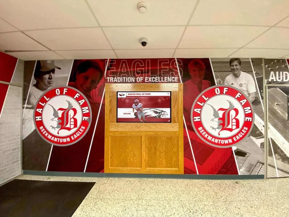
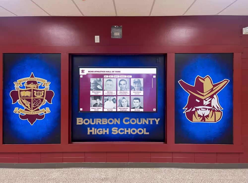
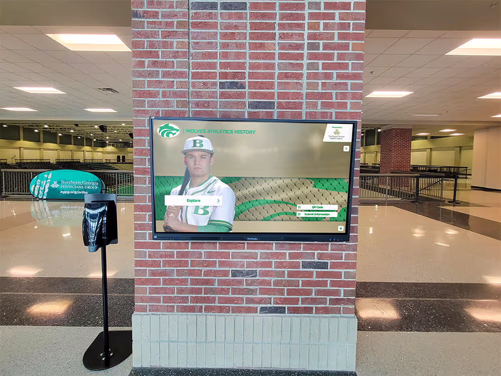
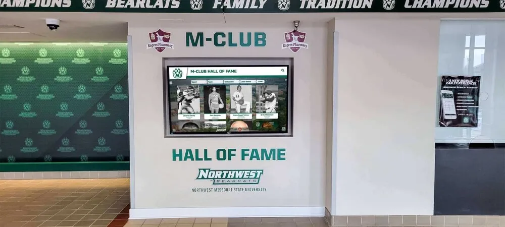
Beyond the Yearbook: Year-Round Volleyball Recognition
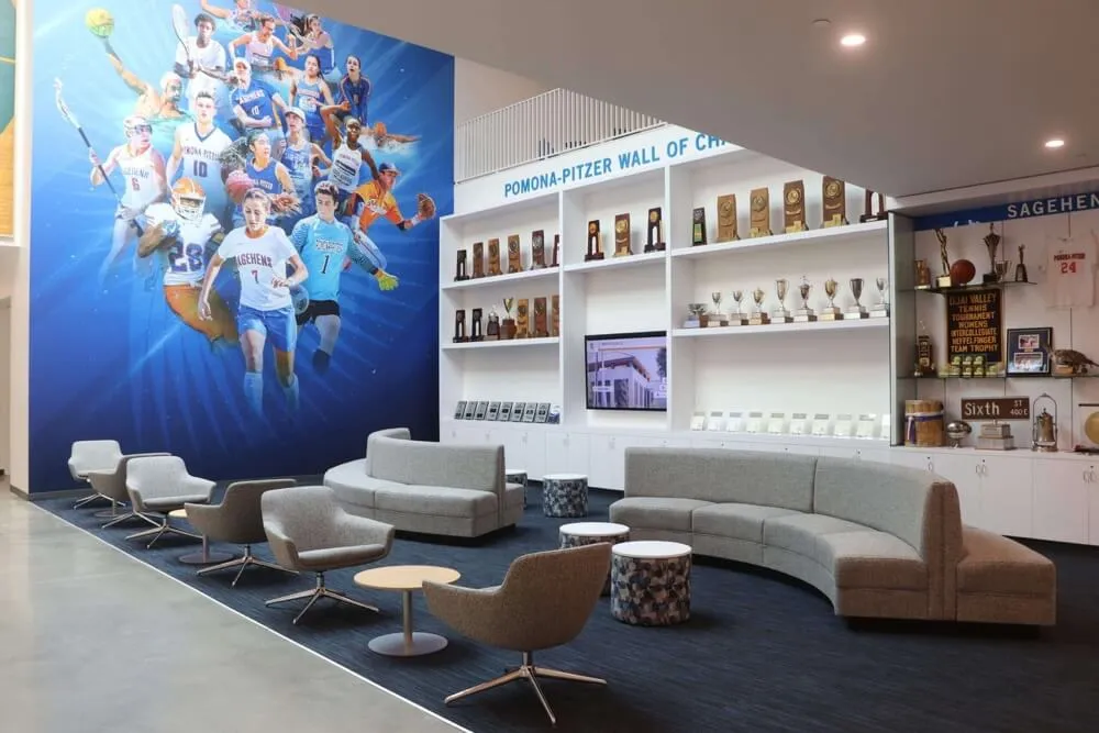
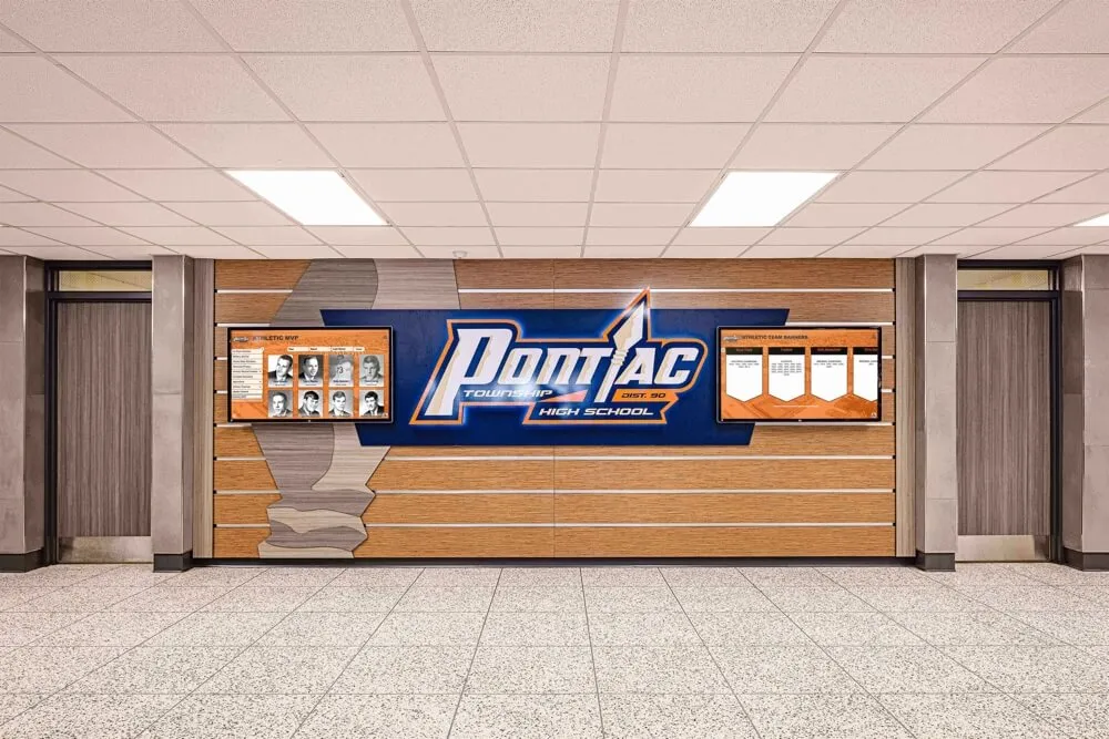
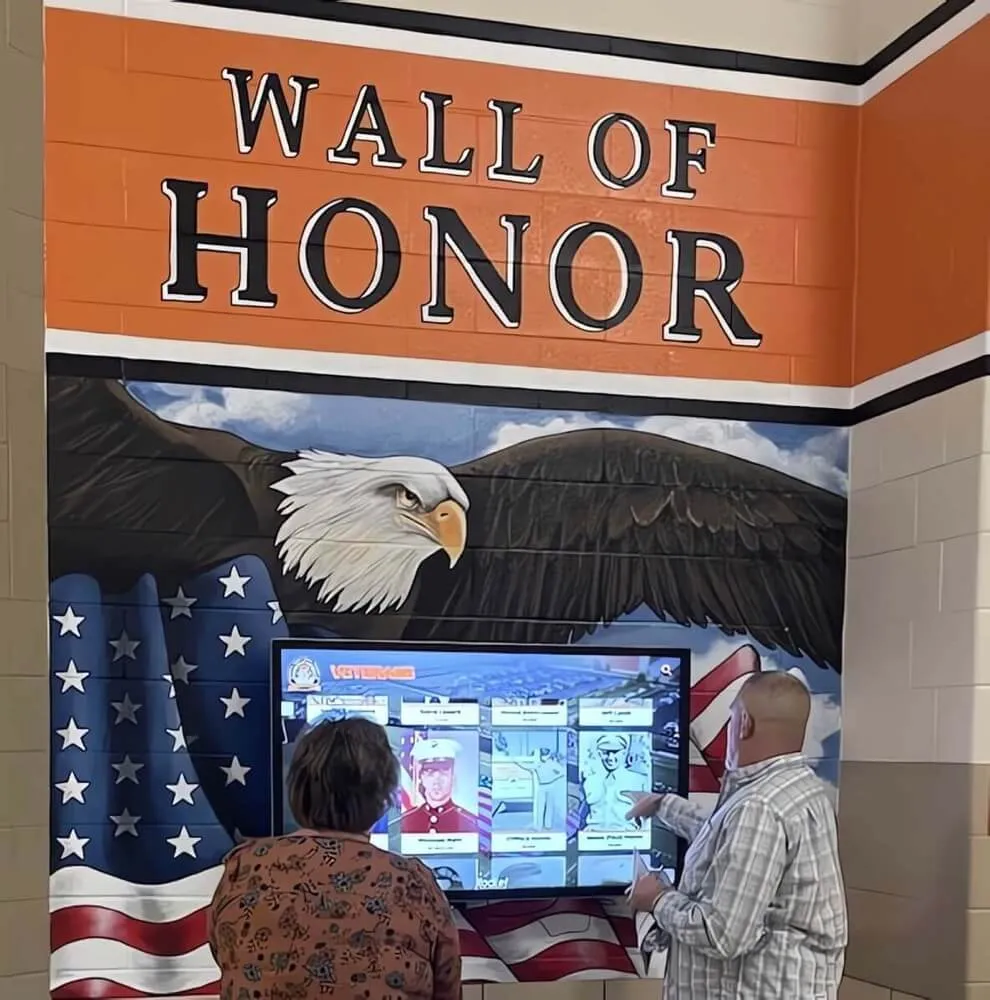
The yearbook captures a season in print, but recognition doesn’t have to end when the final issue ships. Many schools are extending their athletic recognition into digital formats that give volleyball programs ongoing visibility.
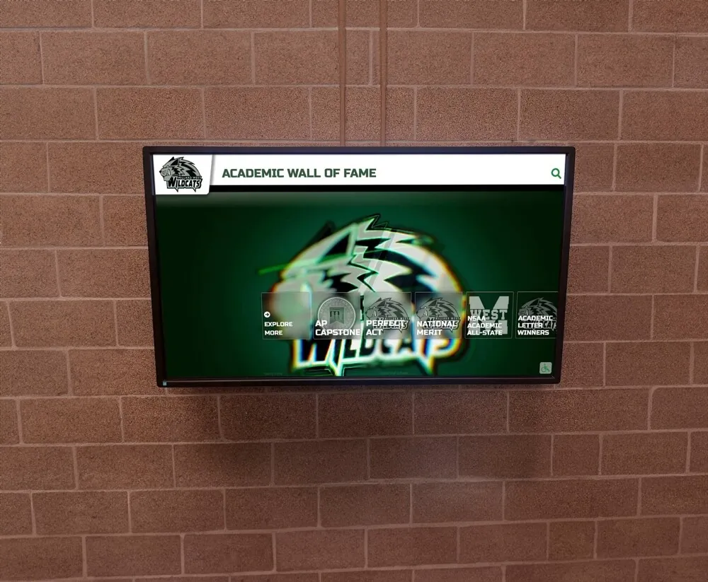
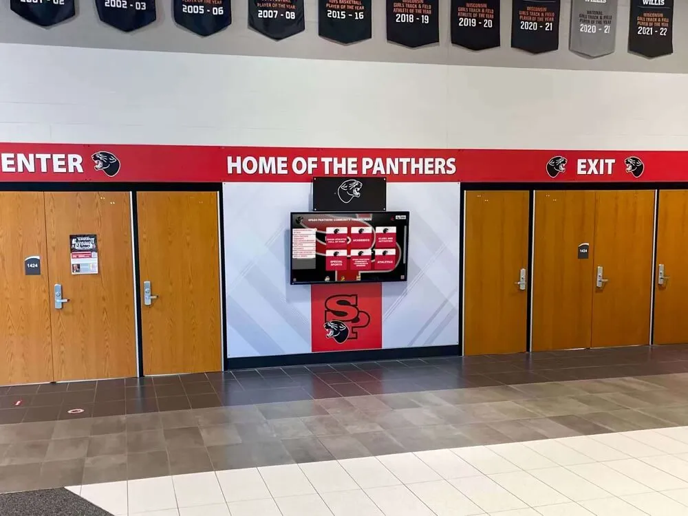
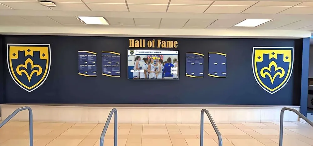
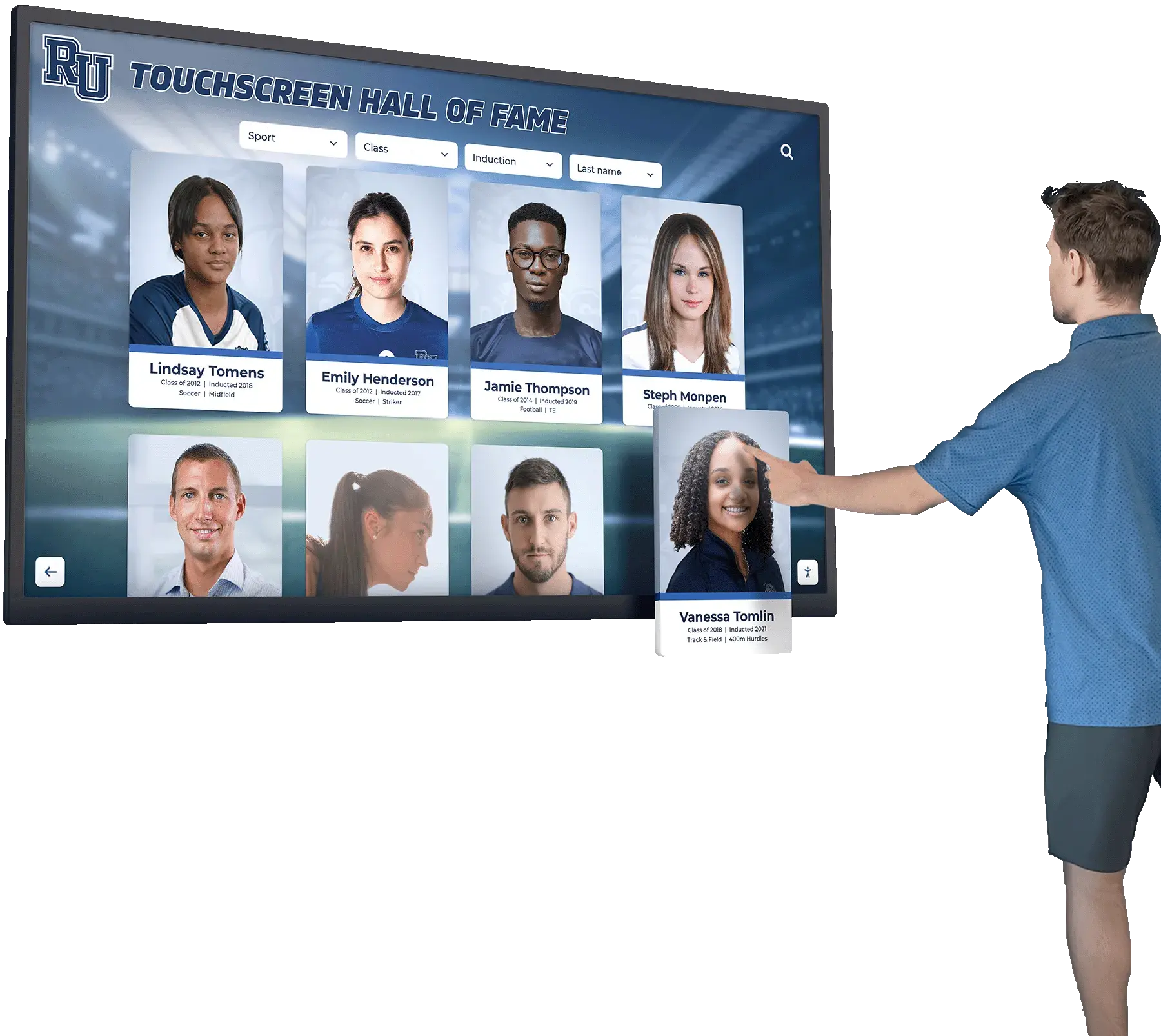
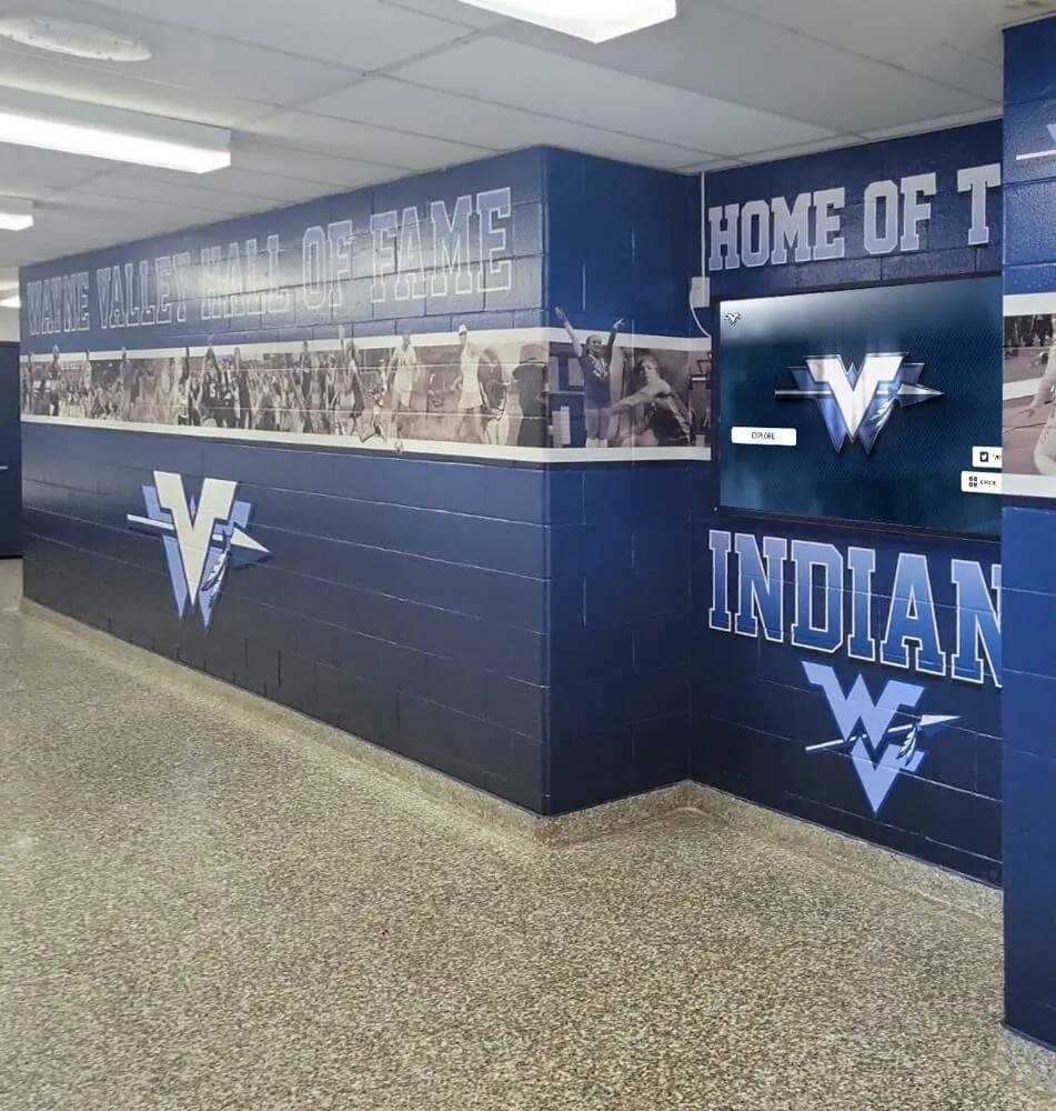
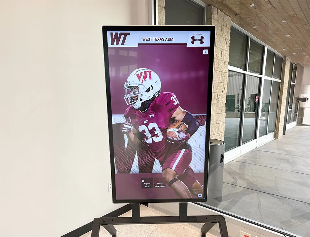
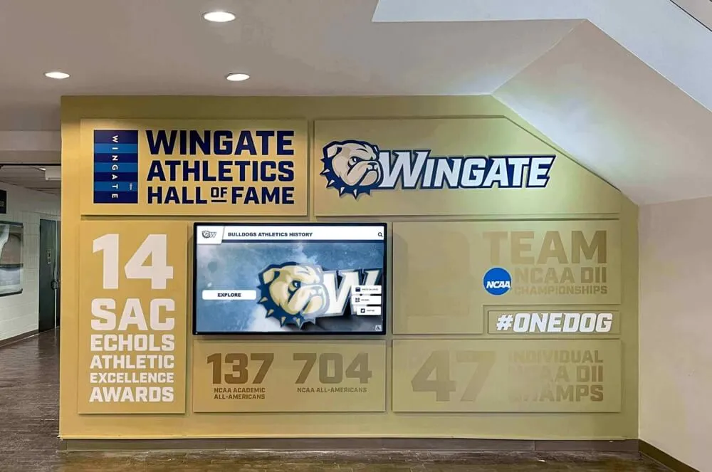
Interactive touchscreen displays in school hallways and athletic facilities can showcase:
- Season records and all-time stat leaders updated automatically as seasons accumulate
- Program history going back to the sport’s founding at the school
- State tournament appearances and championship years
- Individual award winners with photos and context
These systems effectively function as a permanent, evolving volleyball yearbook that anyone can explore—current players, prospective athletes touring the facility, alumni visiting for reunions, or parents at home games.
Understanding what a digital hall of fame offers compared to traditional static displays helps athletic departments make informed decisions about recognition infrastructure. When combined with athlete of the week recognition programs and program-wide team recognition systems, digital displays create a recognition ecosystem that gives volleyball players acknowledgment throughout the year, not just when the yearbook comes out in spring.
Schools building out their recognition infrastructure should also look at how team recognition integrates with broader team celebration ideas for athletic programs to build cultures where achievement gets consistently visible acknowledgment.
Common Mistakes to Avoid on Volleyball Yearbook Pages
After all the planning and production, a few avoidable mistakes most often undercut volleyball spreads:
Overloading the roster. A full roster grid with every player’s name takes space but adds little when it comes at the expense of storytelling. Consider whether a shorter honors list (starters, award winners) serves the spread better than a complete alphabetical roster.
Ignoring the bench. Action photos focus on the players who touch the ball most. But the player who came off the bench in the second set of a regional match and served four straight aces deserves her moment too. Intentional coverage across the roster reflects the team’s actual experience.
Using posed photos exclusively. Team photos have their place, but spreads built entirely from posed group shots miss the emotional truth of competition. At least half your photos should come from actual match play.
Forgetting to proofread stats and names. Statistics blocks and player profiles contain many individual names, numbers, and details. Errors in these sections are particularly visible and hurt more than a typo in body copy. Build time for a dedicated fact-check pass before final submission.
Recycling last year’s design. If your volleyball spread looks identical to last year’s except for the photos, this year’s team isn’t getting its own story told. Each season deserves a fresh visual approach.
Putting It All Together: A Volleyball Spread Checklist
Before submitting your volleyball section for final review, work through this checklist:
- Season narrative written (150+ words, specific opening moment, clear arc)
- Action photography: at least 4 photos from live match play
- Team photo included
- Coach recognition: photo and quote
- Senior spotlight: individual profiles with stats and quotes for all seniors
- Season statistics block: individual and team stats formatted clearly
- Final record prominently displayed
- Conference and state tournament results documented
- All player names verified against official roster
- All statistics verified against official season records
- Captions on every photo with name, class year, and contextual information
- Design consistent with school brand colors and yearbook style guide
- Spread reviewed for grammar and spelling
Meeting every item on this checklist produces a volleyball yearbook page that players, coaches, and families will point to as a genuine record of a season they gave everything to.
Ready to give your volleyball program recognition that lasts beyond the yearbook’s final printing? Rocket Alumni Solutions builds interactive digital displays and record boards that let schools preserve every season’s achievements in searchable, always-updated formats—so the players who built your volleyball program get acknowledged every year, not just in May.