

Designing an effective digital hall of fame touchscreen display layout represents one of the most impactful investments educational institutions and organizations can make in recognition technology. Unlike traditional static plaques that simply list names and dates, thoughtfully designed touchscreen displays become engaging interactive experiences that honor achievement while inviting exploration, telling compelling stories, and creating memorable connections between visitors and the excellence being celebrated.
The difference between a touchscreen display that sits unused and one that consistently engages visitors comes down to design strategy. Successful digital hall of fame layouts balance intuitive navigation with rich content, create visual hierarchies that guide exploration, incorporate multimedia storytelling that brings recognition to life, and ensure accessibility for users of all ages and abilities. These design decisions directly impact whether your recognition investment becomes a cherished community asset or merely expensive digital wallpaper.
Why Touchscreen Display Layout Design Matters
The layout and user experience of your digital hall of fame determines whether visitors engage deeply or walk past without interaction. Effective design ensures intuitive navigation that feels natural without instruction, compelling visual presentation that attracts attention and invites exploration, efficient information hierarchy that helps users find what they seek quickly, accessible interfaces that welcome users regardless of technical comfort level, and memorable experiences that visitors remember and discuss with others. Organizations implementing strategic touchscreen layout design discover dramatic increases in user engagement, extended interaction times, stronger emotional connections to recognized achievement, and greater return on recognition technology investment.
Understanding Digital Hall of Fame Display Contexts
Before diving into specific design strategies, understanding where and how visitors will interact with your touchscreen display shapes every subsequent design decision.
High-Traffic Public Spaces
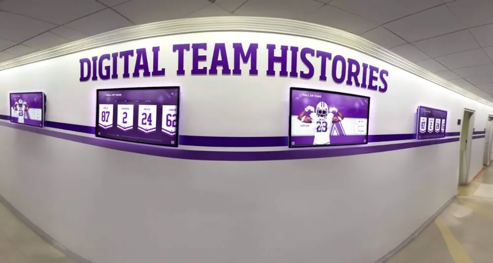
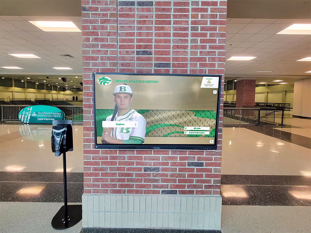
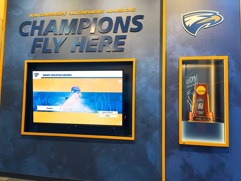
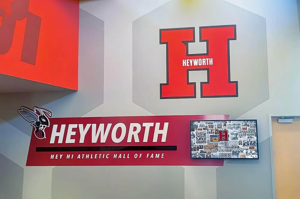
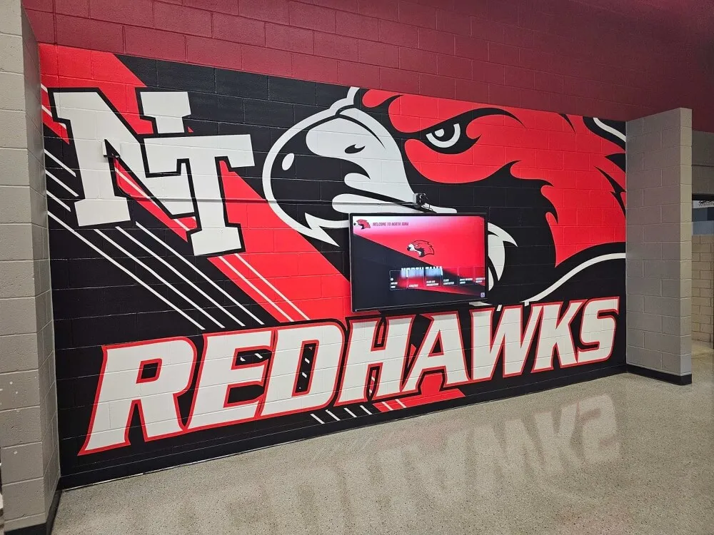
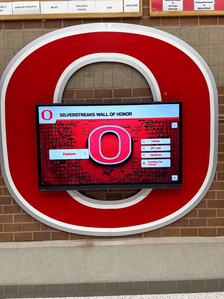
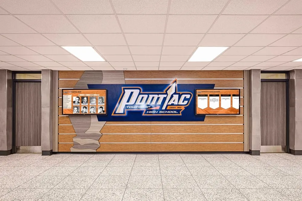
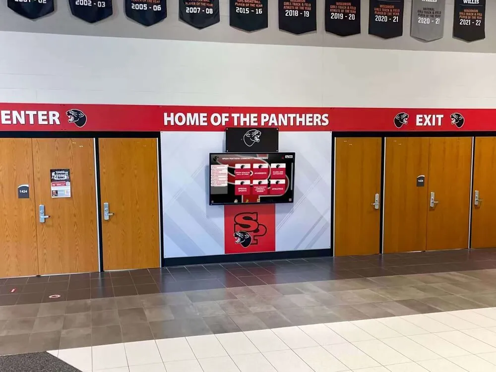
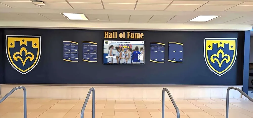
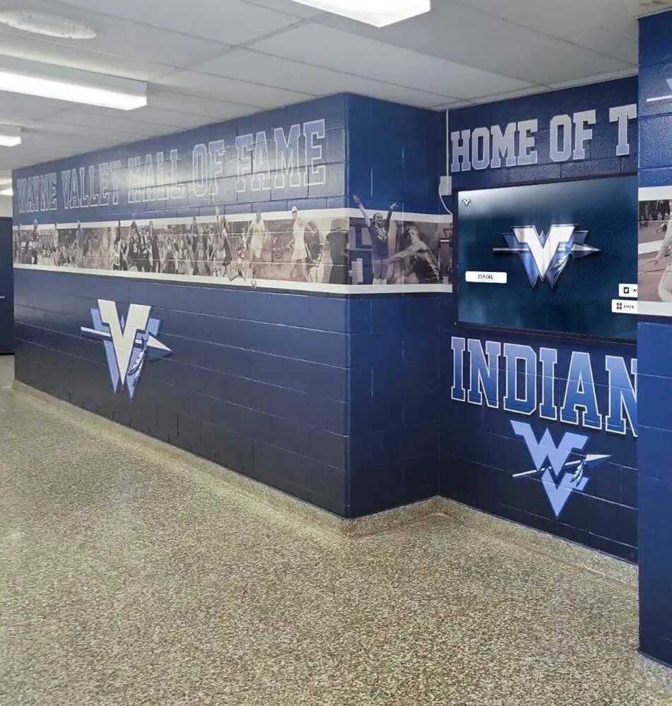
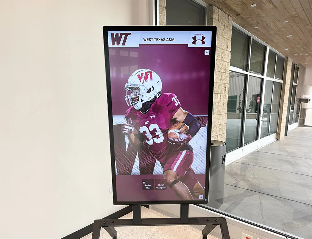
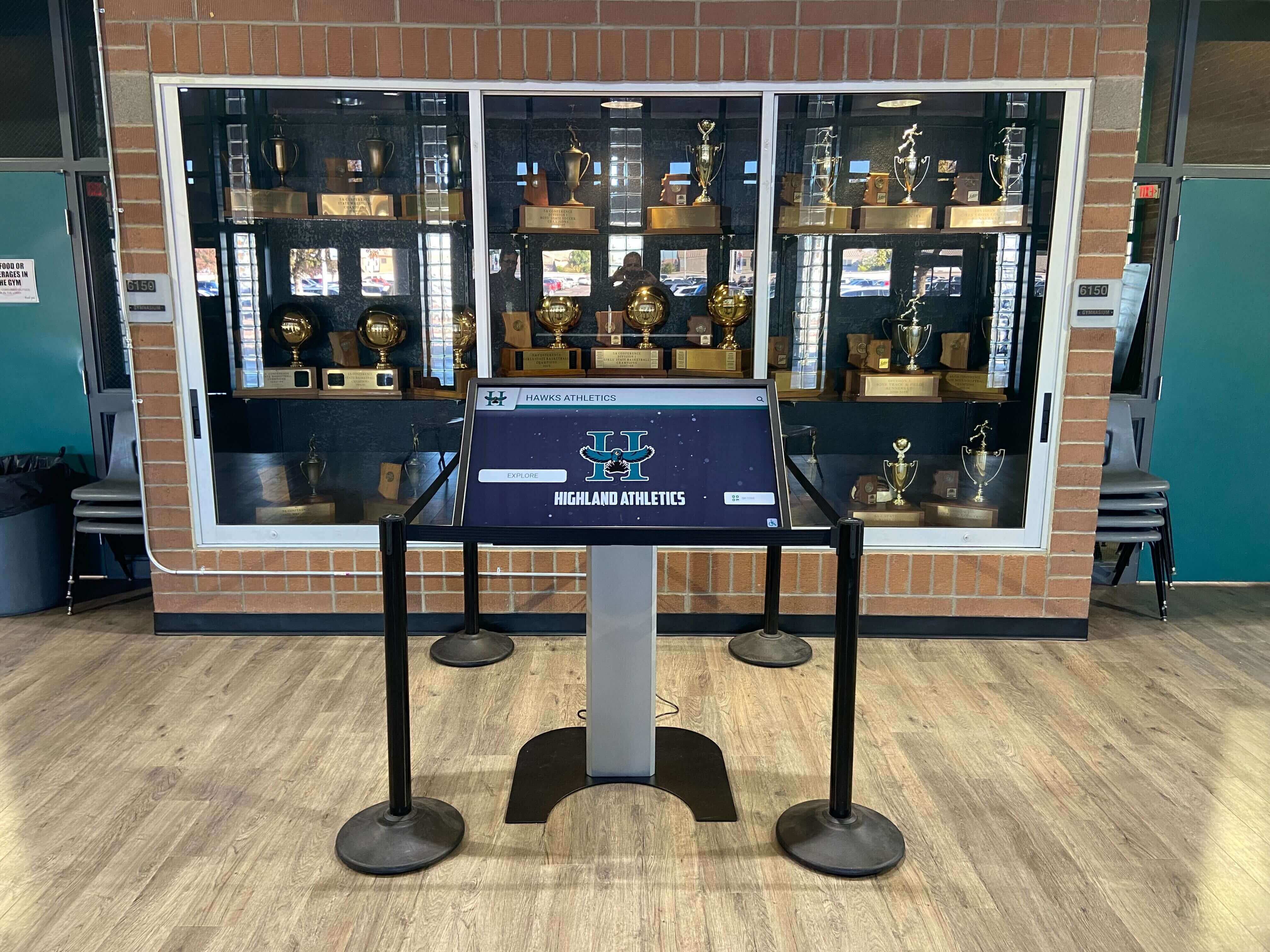
Digital hall of fame displays positioned in high-traffic areas like school lobbies, athletic facility entrances, or community center hallways serve walk-by audiences who may pause spontaneously but weren’t specifically seeking recognition content. These contexts require instantly compelling visual design that stops traffic, clear calls-to-action visible from distance, engaging homepage content that communicates purpose immediately, and quick-access navigation enabling brief but satisfying interactions for time-constrained visitors.
High-traffic contexts prioritize attention-grabbing design and efficient navigation that delivers value quickly to visitors who may only interact for 30-60 seconds before continuing to their primary destination.
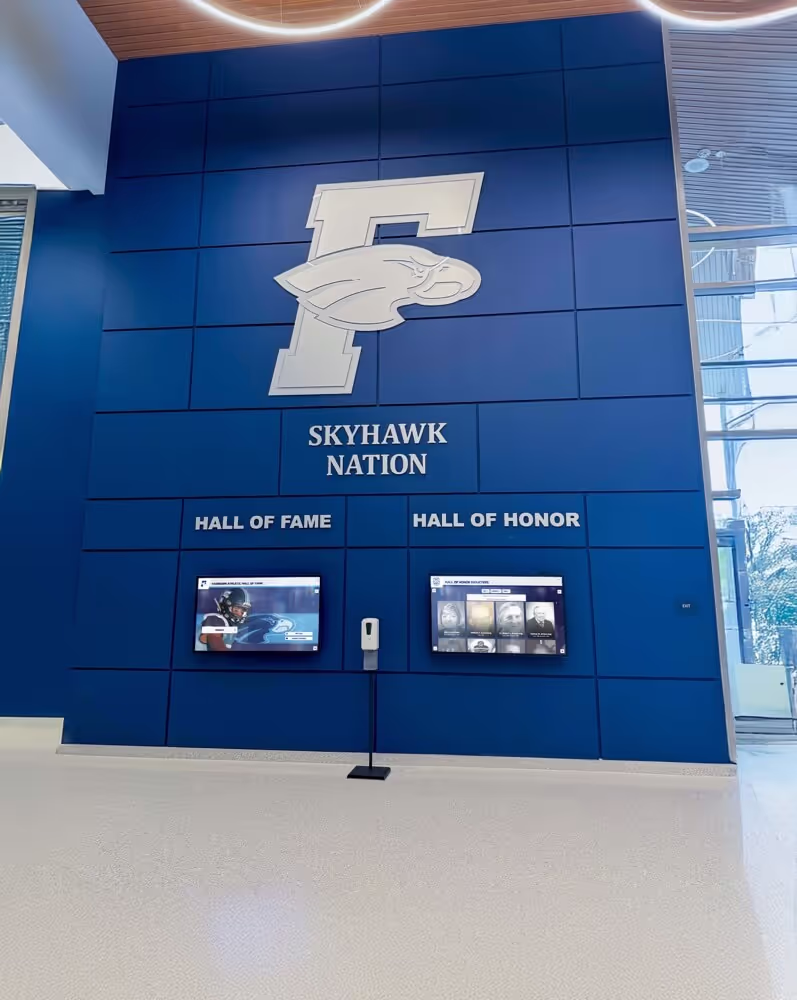
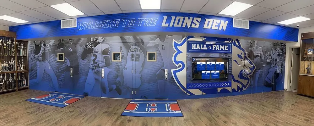
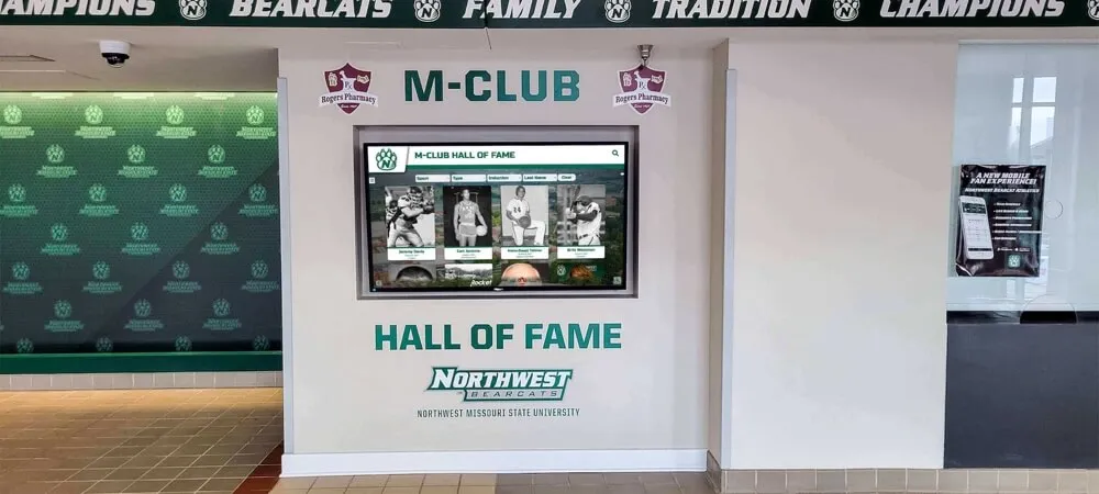
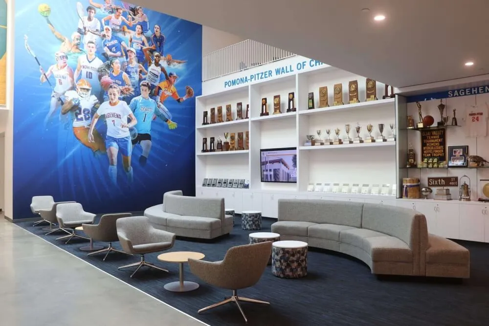
Dedicated Recognition Spaces
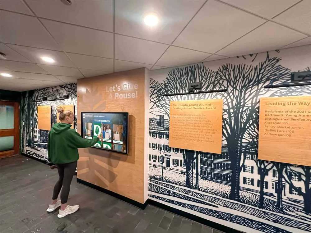
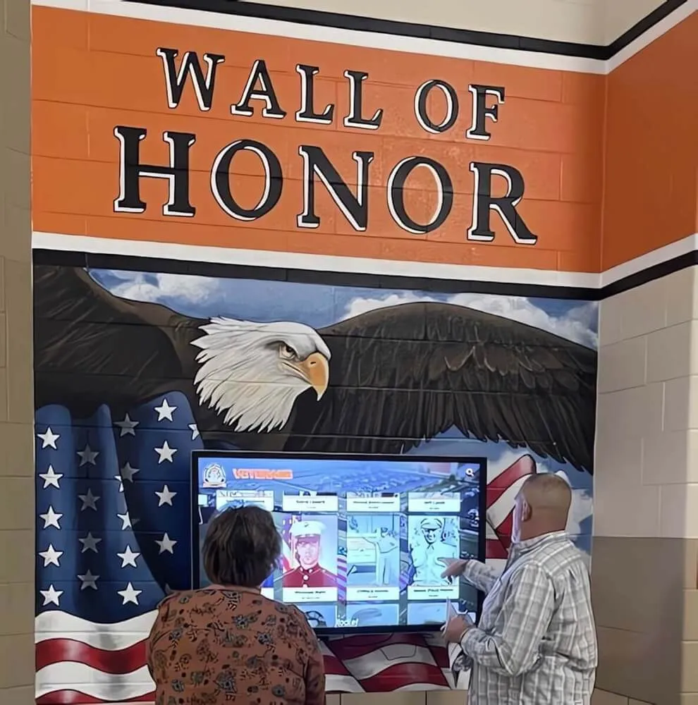
Displays installed in dedicated recognition areas like hall of fame rooms, trophy lounges, or memorial spaces serve focused audiences who intentionally seek recognition content and expect deeper engagement. These contexts support more complex navigation structures with multiple content layers, comprehensive profile information with extensive detail, multimedia content including longer videos and document archives, and sophisticated search and filter capabilities enabling targeted discovery.
Dedicated spaces allow more nuanced design that rewards extended exploration rather than optimizing purely for quick interactions.
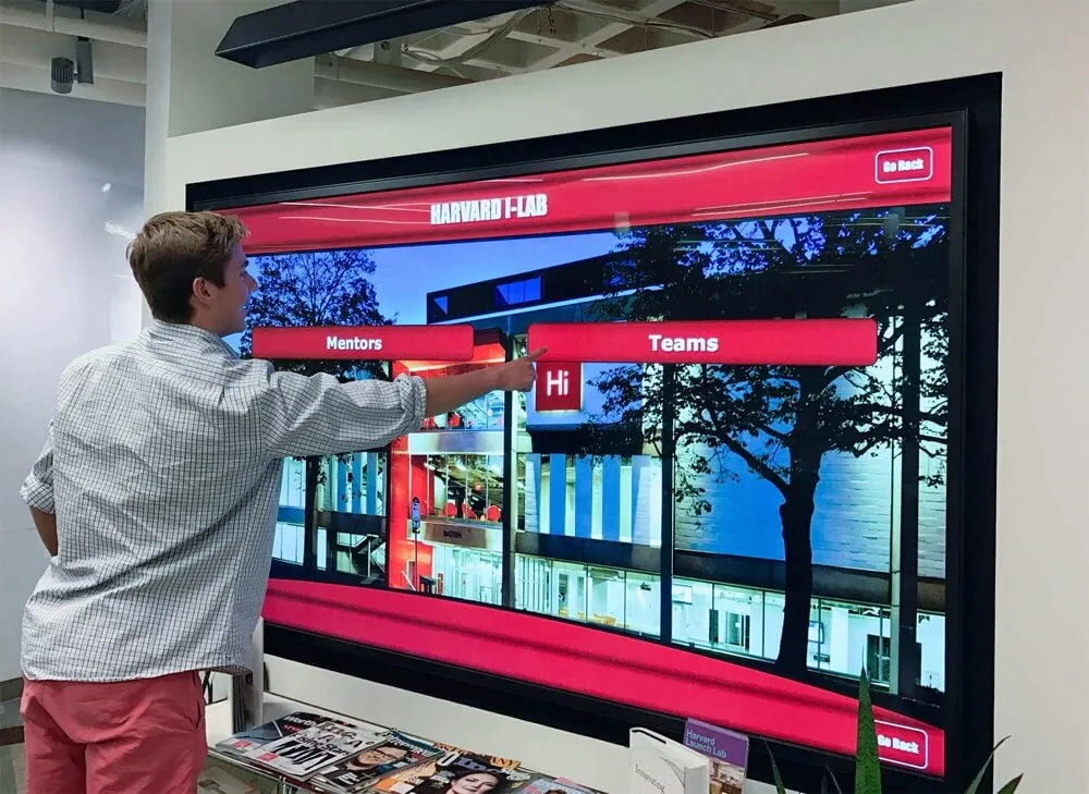
Event and Tour Contexts
Touchscreen displays featured during campus tours, homecoming celebrations, or donor recognition events serve facilitated audiences often experiencing guided interaction from tour guides, event hosts, or institutional representatives. These contexts benefit from demonstration-friendly navigation with obvious interaction patterns, impressive visual presentations that reinforce institutional quality, content that tells institutional stories effectively, and features enabling personalized searches for specific individuals during tours.
Event contexts prioritize design that looks impressive during demonstrations while supporting the storytelling and relationship-building goals of guided experiences.
Foundational Layout Design Principles
Effective touchscreen display layouts rest on fundamental design principles adapted from web design, mobile apps, and physical kiosk interfaces while accounting for unique recognition display requirements.
Visual Hierarchy and Information Architecture
Visual hierarchy guides users’ attention through content systematically, ensuring they notice the most important elements first while being able to navigate deeper when desired. Effective hierarchy implementation uses size and scale to emphasize primary content, strategic color contrast drawing attention to interactive elements, consistent spacing creating clear content groupings, typography variation distinguishing headings from body content, and visual weight distribution balancing screen composition.
Information architecture organizes content logically, grouping related items, creating intuitive category structures, and establishing navigation paths that match users’ mental models of how content should be organized. Poor information architecture leaves users confused about where to find information even when individual screen designs look attractive.
Consistency and Pattern Recognition
Consistent design patterns allow users to learn your interface quickly and predict how interactions will work throughout the system. Design consistency includes navigation elements appearing in consistent locations, interactive elements using consistent visual styling, similar content types following consistent templates, color coding maintaining consistent meaning, and interaction patterns behaving predictably across all screens.
When users must relearn navigation on every screen, frustration increases while engagement decreases. Consistency reduces cognitive load, allowing users to focus on content rather than interface mechanics.
Accessibility and Universal Design
Accessible design ensures all community members can engage with recognition displays regardless of age, technical comfort, vision capabilities, or physical abilities. Accessibility considerations include touch target sizing accommodating finger accuracy limitations, sufficient color contrast meeting WCAG standards, text sizing readable from typical viewing distances, simple language avoiding unnecessary jargon, audio alternatives for text-heavy content, and physical positioning appropriate for various heights including wheelchair users.
Accessibility represents both ethical imperative and practical advantage—designs serving diverse users typically work better for everyone while expanding your potential audience significantly.
Touch-Specific Interaction Patterns
Touchscreen interfaces require different design considerations than mouse-based computer interfaces. Touch-specific design includes minimum touch target sizes of 44-48 pixels, adequate spacing between interactive elements preventing accidental touches, visual feedback confirming touches registered successfully, gesture support for common actions like swiping and pinching when appropriate, and “up triggering” activating actions on touch release rather than initial touch to reduce errors.
Failing to account for touch-specific interaction patterns creates frustrating experiences where users accidentally trigger wrong actions or must precisely aim fingers at tiny targets while standing at potentially awkward angles.
Strategic Homepage Design
The homepage represents your most critical design decision—it determines whether visitors engage at all. Successful homepage layouts balance multiple objectives while creating immediate compelling experiences.
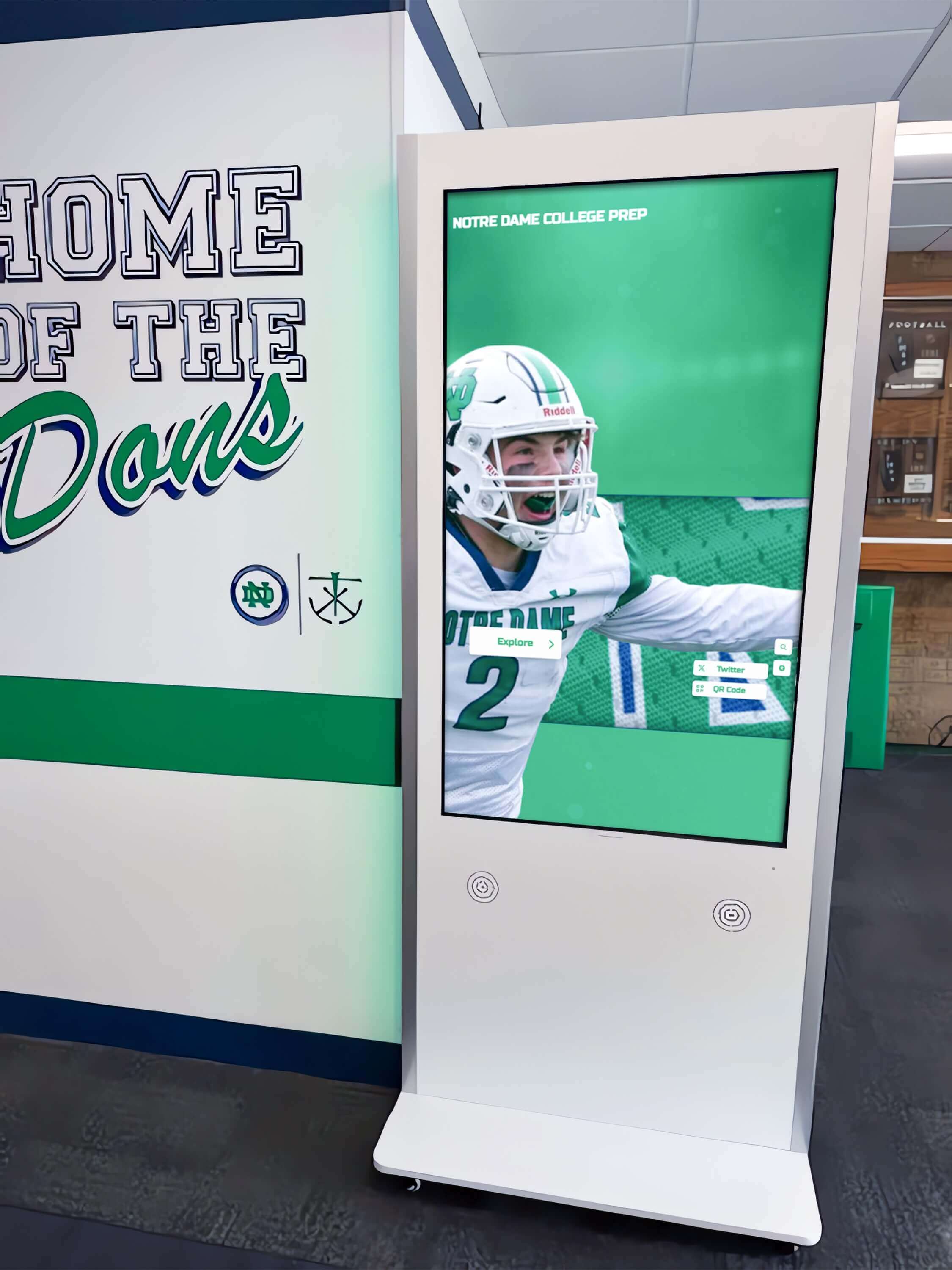
Creating Compelling First Impressions
Visitors form impressions within seconds of encountering your display. Effective homepage designs immediately communicate purpose through clear headlines or titles, showcase featured content highlighting compelling stories, incorporate motion through video backgrounds or animated elements, maintain visual quality with professional photography and graphics, and reflect institutional branding creating immediate recognition and credibility.
The homepage answers visitors’ immediate questions: “What is this?” and “Why should I interact?” Design that fails to answer these questions clearly loses potential users before they engage.
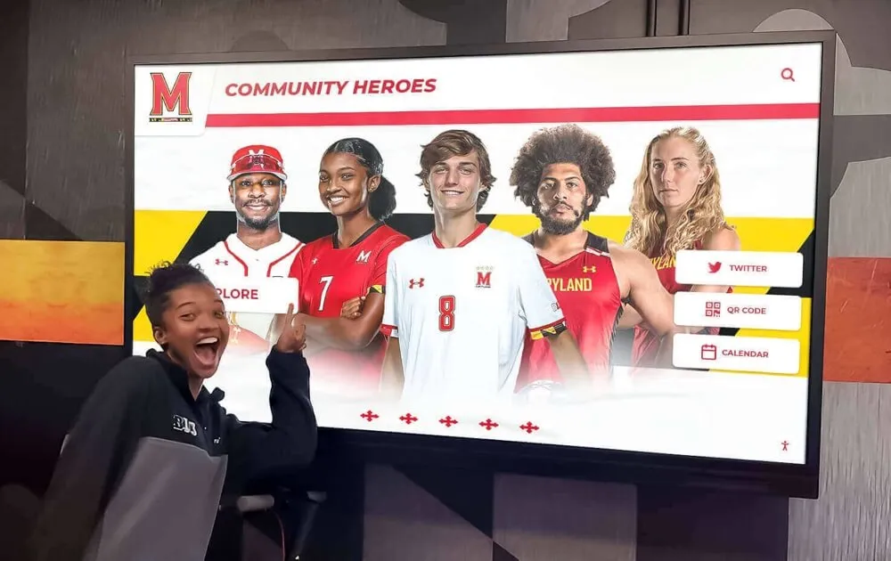
Homepage Content Strategy
Determining what content appears on the homepage shapes how users begin their exploration journey. Effective homepage content strategies include featured recognition profiles rotating to highlight diverse achievers, recent additions showcasing newly inducted or recognized individuals, curated collections like championship teams or milestone anniversaries, search and browse entry points providing clear navigation pathways, and impact content like statistics or timelines demonstrating scope of excellence.
Homepage content should represent your recognition program’s diversity and breadth while providing multiple entry points serving users with different interests and search strategies. Solutions like touchscreen software platforms offer flexible homepage configuration enabling institutions to customize featured content based on their unique priorities and audiences.
Balancing Featured Content with Navigation
Successful homepages balance showcasing specific content with providing clear navigation to broader collections. Design approaches include prominent search bars enabling immediate targeted discovery, category navigation showing major content groupings, visual browsing through thumbnail grids or carousels, and featured content occupying primary screen real estate while navigation remains accessible.
The specific balance depends on your use context—high-traffic locations may prioritize visual featured content that engages passive viewers, while dedicated recognition spaces might emphasize navigation enabling focused searching.
Background and Visual Treatment
Homepage backgrounds significantly impact aesthetic appeal and usability. Background approaches include video backgrounds showing institutional scenes or recognition moments, photographic backgrounds featuring high-quality imagery with text overlay, abstract or branded graphics reflecting institutional identity, and simple solid colors or subtle patterns prioritizing content visibility.
Whatever background approach you choose, ensure sufficient contrast between background and foreground content—beautiful backgrounds that make text difficult to read undermine usability despite aesthetic appeal.
Navigation Design and Content Discovery
Once users move beyond the homepage, navigation design determines whether they find desired content efficiently or become frustrated and disengage.
Primary Navigation Patterns
Several navigation patterns prove effective for digital hall of fame displays, each with distinct advantages. Common approaches include category-based navigation grouping inductees by type, sport, or era, chronological navigation organized by induction year or achievement date, search-first approaches emphasizing keyword or name search, and hybrid models combining multiple navigation approaches.
The optimal navigation pattern depends on your content volume and user needs. Small halls of fame with 50-100 inductees may use simple category navigation, while large collections require robust search capabilities and multiple filtering options. Implementing comprehensive digital hall of fame touchscreen experiences requires navigation scaled appropriately to content volume.
Search Functionality Design
Search represents the fastest path to specific content, but effective search requires thoughtful design and implementation. Search design considerations include prominent search field placement making discovery obvious, predictive search suggesting matches as users type, search result presentation clearly showing matches with relevant context, filter options enabling result refinement, and graceful handling of zero-result searches suggesting alternatives.
Search proves particularly valuable during tours and alumni events when institutional representatives need to quickly find specific individuals to show visitors, making demonstration-friendly search design especially important for displays in tour-heavy environments.
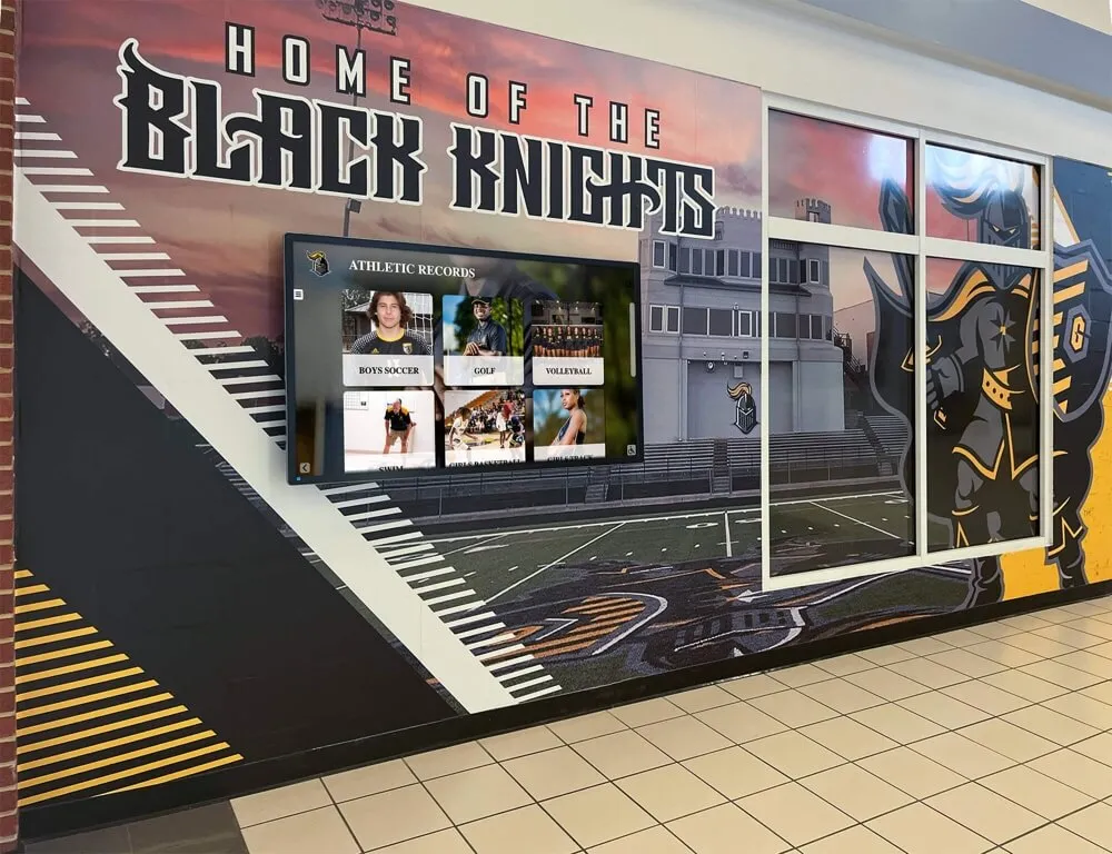
Category and Filter Systems
Category navigation and filtering help users browse collections systematically. Effective category systems use intuitive groupings that match how users think about content, visual distinction making categories easily scannable, consistent category structures throughout the system, and progressive disclosure revealing subcategories or refinement options as needed.
Athletic halls of fame commonly organize by sport, while academic recognition might group by achievement type or field of study. The key lies in choosing organizational schemes that feel obvious to your specific audience rather than forcing users to guess how content might be categorized.
Breadcrumb Navigation and Wayfinding
As users navigate deeper into content, wayfinding elements help them understand their location and return to previous screens. Wayfinding approaches include breadcrumb trails showing navigation path, persistent home or back buttons enabling quick navigation, section indicators showing current location, and navigation history allowing users to review recently viewed profiles.
Clear wayfinding reduces cognitive load and prevents the disorientation that occurs when users lose track of where they are within the system—a common problem in complex recognition displays without adequate orientation cues.
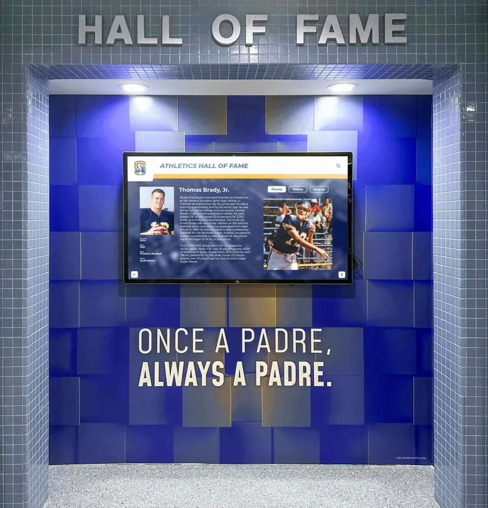
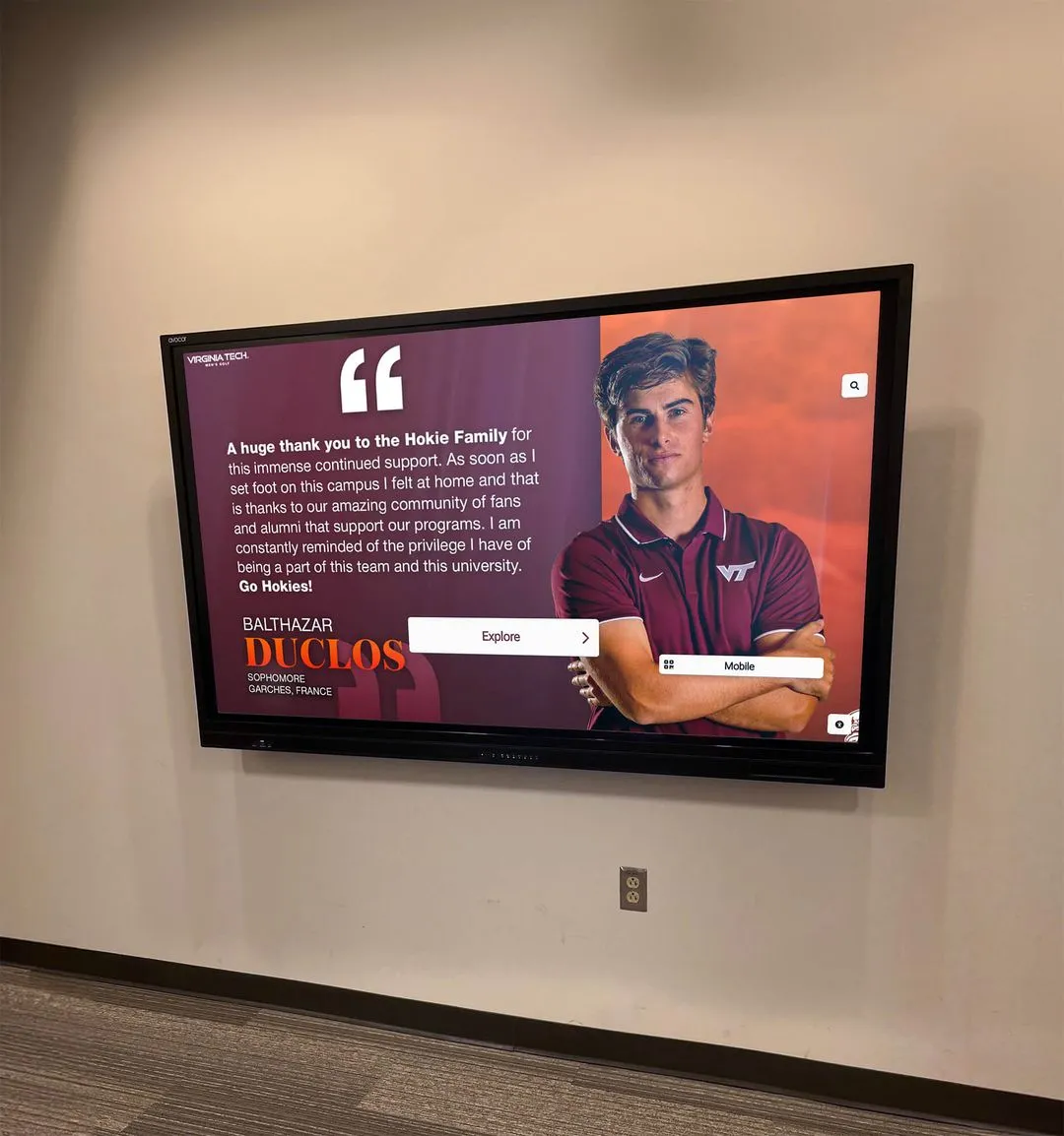
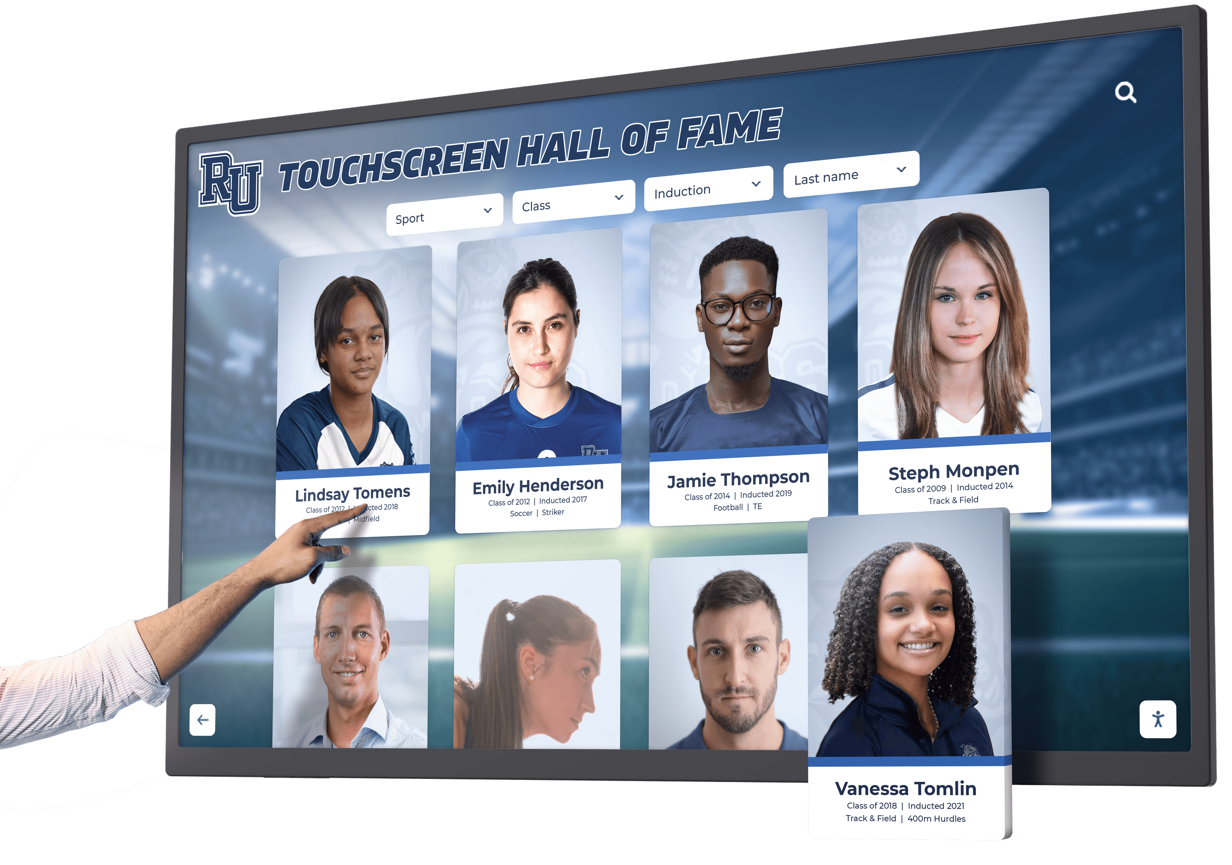
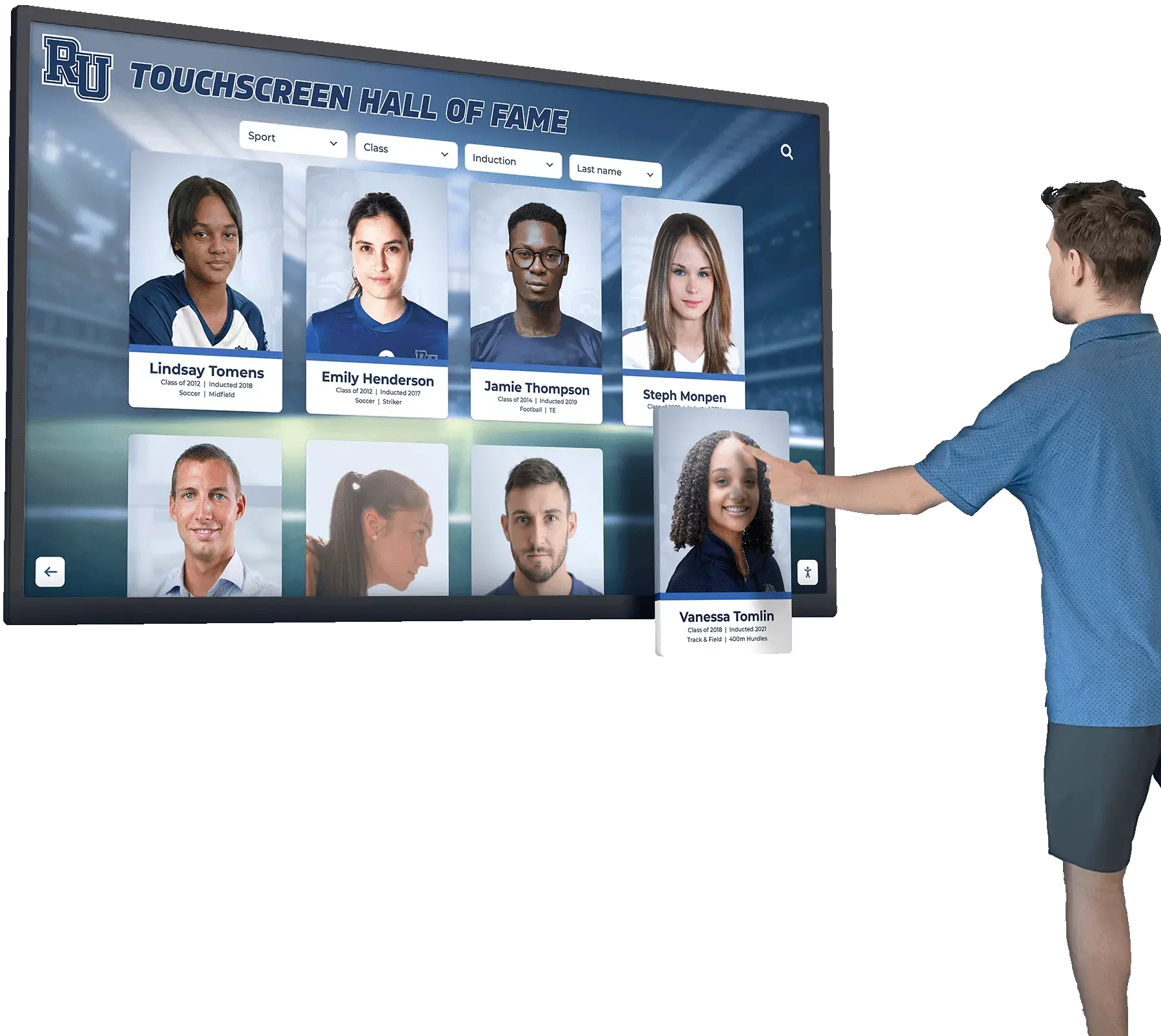
Profile Page Layout and Design
Individual recognition profiles represent your most important content—the ultimate destination after navigation. Profile layouts shape how honorees’ stories are told and achievements are celebrated.
Essential Profile Components
Effective recognition profiles include several key information components that together create comprehensive achievement portraits. Standard profile elements include professional headshot or achievement photography, full name with proper pronunciation if needed, induction year or recognition date, achievement summary highlighting key accomplishments, biographical information providing personal context, career highlights or milestone achievements, multimedia content including videos and photo galleries, and connection to related profiles like teammates or colleagues.
The specific components and their prominence vary based on recognition type—athletic profiles emphasize statistics and achievements, while donor recognition focuses on philanthropic impact and motivation. Comprehensive digital hall of fame design strategies ensure profile content serves recognition goals while creating engaging user experiences.
Visual Profile Layouts
Profile layouts organize information components into coherent visual designs. Common layout patterns include hero image layouts with large photography dominating the screen, split-screen designs dividing photography and text content, card-based layouts organizing information into distinct content blocks, scrolling layouts accommodating extensive content on single pages, and tabbed layouts separating different content types like biography, statistics, and media.
The optimal layout depends on content volume and type—profiles with extensive statistics benefit from tabbed organization, while primarily biographical profiles work well with scrolling layouts that tell stories chronologically.
Multimedia Integration
Multimedia content transforms recognition from simple information presentation to compelling storytelling. Multimedia elements include profile videos featuring interviews or achievement footage, photo galleries documenting careers or milestones, audio clips with commentary or acceptance speeches, document displays showing awards or achievements, and video playlists organizing multiple related videos.
Multimedia integration requires careful design ensuring smooth playback, clear controls, appropriate sizing, and seamless integration with text content rather than feeling like disconnected additions. The most effective profiles weave multimedia throughout the experience rather than segregating it into separate media sections.
Typography and Readability
Profile text must remain readable from typical viewing distances of 18-36 inches while accommodating users with various vision capabilities. Typography best practices include minimum font sizes of 18-20pt for body text, high-contrast color combinations meeting WCAG AA standards, clear typographic hierarchy distinguishing headings and body text, adequate line spacing improving readability, and appropriate line length preventing overly wide text blocks difficult to track.
Beautiful typography that’s unreadable from normal viewing distance undermines recognition effectiveness—readability must never be sacrificed for aesthetic considerations.
Visual Design and Branding Integration
Visual design creates the aesthetic appeal and emotional impact that makes recognition memorable while communicating institutional quality and values.
Color Strategy and Psychology
Color choices significantly impact user experience, accessibility, and emotional response. Color strategy considerations include institutional branding colors maintaining identity consistency, sufficient contrast ensuring readability and accessibility, color psychology leveraging emotional associations, consistent color coding using specific colors for specific purposes throughout, and consideration for color blindness ensuring information isn’t conveyed through color alone.
Athletic programs often use team colors prominently, while academic institutions may opt for more subdued professional palettes. Whatever palette you choose, ensure it serves functional purposes beyond pure aesthetics.
Photography and Imagery Standards
High-quality photography distinguishes professional recognition displays from amateur efforts. Photography standards include consistent styling creating visual cohesion across inductees, professional quality with appropriate resolution and lighting, authentic representation showing genuine achievement moments, diverse visual content representing your full community, and appropriate image treatment like cropping and color correction.
Institutions with inconsistent photography spanning decades benefit from establishing standards for how archival photos are treated versus recent professional photography, creating visual cohesion despite varied source material.

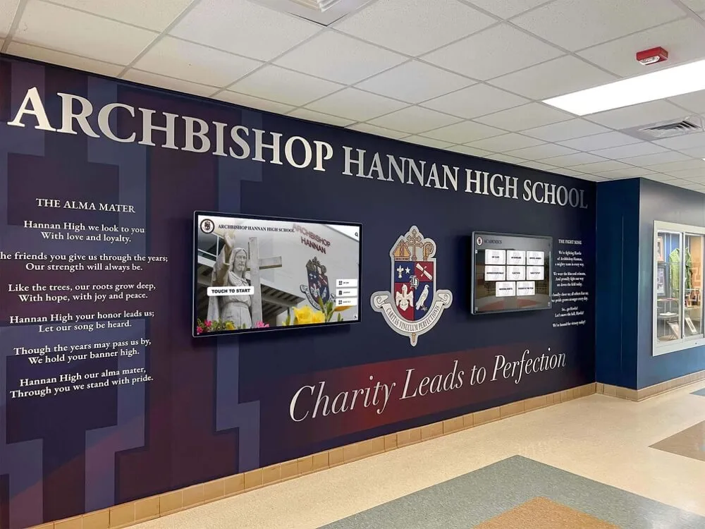
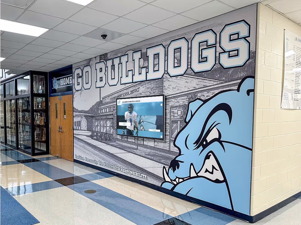
Brand Consistency and Institutional Identity
Digital recognition displays should feel unmistakably connected to your institution through consistent branding. Branding integration includes logos and wordmarks appropriately placed, typography matching institutional brand standards, color palettes reflecting brand guidelines, graphic elements and treatments consistent with other institutional communications, and overall design aesthetic aligning with institutional character.
Brand consistency builds credibility and reinforces that recognition represents official institutional honor rather than informal appreciation. Schools and organizations implementing state championship recognition displays ensure that display design reflects their institutional brand throughout.
Motion and Animation
Subtle motion and animation add visual interest while guiding user attention. Effective animation includes transition animations between screens creating polish, microinteractions providing feedback on touch actions, attention-drawing animations highlighting interactive elements, content animations like fading or sliding new content into view, and homepage animations maintaining visual interest during idle periods.
Animation should enhance usability and engagement without becoming distracting or slowing interface responsiveness—the goal remains creating polished experiences rather than showcasing animation capabilities for their own sake.
Content Organization Strategies
How you organize recognition content shapes whether users can discover achievement stories and find specific individuals efficiently.
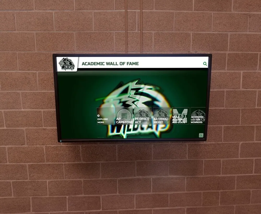
Categorization Approaches
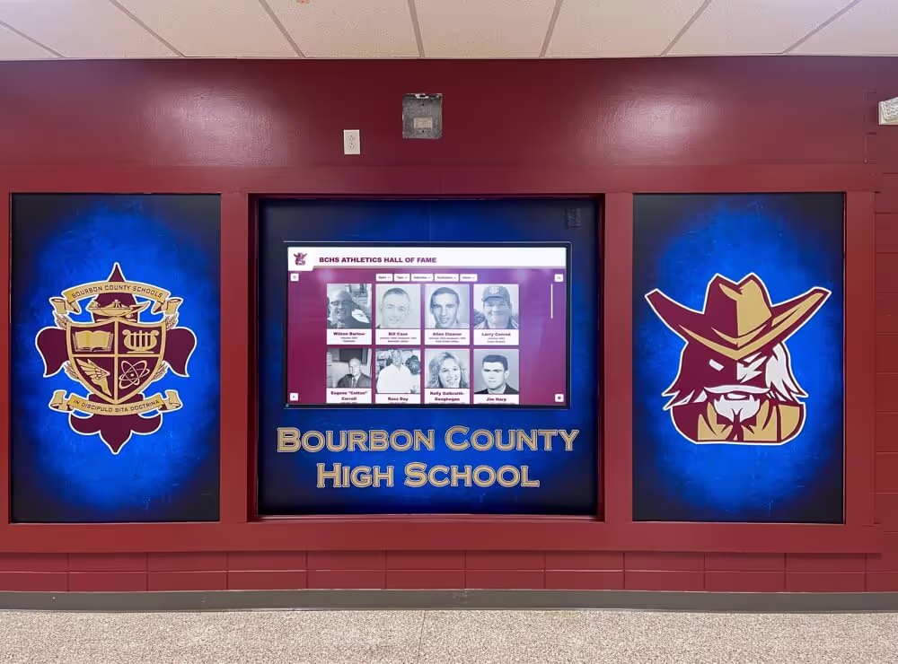
Different organizational structures serve different recognition contexts. Common categorization approaches include achievement-based organization grouping by award or recognition type, chronological organization by induction year or achievement date, departmental or unit-based organization grouping by school, program, or team, alphabetical organization for quick name-based discovery, and tag-based organization enabling multiple overlapping categories.
Many systems use hybrid approaches combining multiple organizational schemes—athletic halls of fame commonly offer both sport-based and chronological navigation, allowing users to browse based on their preferred approach. Implementing community showcase recognition requires organizational structures that make diverse achievements easily discoverable.
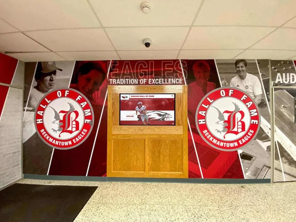
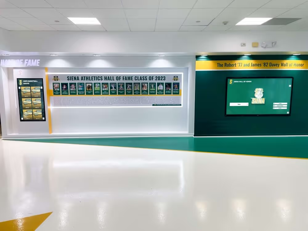
Collection and Grouping Strategies
Beyond individual profiles, grouping related honorees into collections creates narrative opportunities and facilitates browsing. Collection strategies include championship team pages uniting team members, decade or era collections grouping contemporaneous inductees, milestone celebration collections like 50th anniversary honorees, achievement type collections like all scholarship recipients, and curated featured collections highlighting related stories.
Collections create entry points for users interested in browsing rather than searching specific names while enabling storytelling about collective achievement that individual profiles cannot capture alone.
Handling Large Content Volumes
Institutions with extensive recognition collections require design strategies managing hundreds or thousands of profiles without overwhelming users. Large-volume strategies include robust search and filter capabilities, progressive disclosure showing subsets rather than entire collections, pagination or infinite scroll for browsing large lists, featured content curation highlighting selections from large collections, and performance optimization ensuring fast loading despite content volume.
Design approaches perfect for 100-profile halls of fame often fail completely at 500+ profiles—scaling considerations should inform architecture decisions from the beginning. Modern touchscreen software platforms handle large content volumes through purpose-built content management systems designed specifically for recognition applications.
Interaction Design and User Engagement
Beyond layout and visual design, how users interact with your touchscreen display determines engagement depth and satisfaction.
Touch Target Sizing and Spacing
Human fingers have physical limitations that design must accommodate. Touch target best practices include minimum target sizes of 44x44 pixels, preferably 48x48 pixels or larger, adequate spacing between targets preventing accidental touches, larger targets for primary actions reducing precision requirements, and touch area larger than visual button accommodating imprecise touches.
Small, closely-spaced interactive elements create frustrating experiences where users repeatedly trigger wrong actions—generous sizing and spacing dramatically improve usability despite reducing the amount of content fitting on each screen.
Feedback and Responsiveness
Users need immediate feedback confirming their touches registered and the system is responding. Feedback mechanisms include visual highlighting of touched elements, transition animations indicating content is loading, progress indicators for actions requiring time, confirmation screens for significant actions, and sound feedback when appropriate (though sound should remain optional).
Interfaces that don’t provide immediate feedback leave users uncertain whether touches registered, leading to repeated touches and confusion. Feedback should be instant even when subsequent actions require processing time.
Gesture Support
While basic touch interactions remain most important, gesture support can enhance user experience for familiar actions. Common gestures include swiping to navigate between profiles or images, pinching to zoom on photographs, pulling down to refresh content, and multi-finger gestures for advanced actions.
Gesture support should supplement rather than replace button-based navigation—never require gestures for essential functionality since not all users discover or feel comfortable with gesture interactions.
Attention Retention and Idle State Design
When touchscreens sit unused, compelling attract modes draw new users while ensuring displays don’t appear broken or inactive. Idle state strategies include featured content rotation showcasing diverse achievers, statistics or impact displays demonstrating recognition scope, upcoming events or recent additions highlighting current relevance, video montages celebrating achievement, and clear calls-to-action inviting interaction.
Effective attract modes balance visual interest with energy efficiency and screen longevity—avoid static imagery that can cause burn-in while preventing unnecessarily bright or busy displays in quiet spaces.
Responsive Design and Multi-Device Considerations
Digital hall of fame displays span various hardware configurations requiring design flexibility and responsiveness.
Screen Size and Orientation Adaptability
Touchscreens range from vertical 43" displays to horizontal 65" or larger screens, requiring layouts that adapt appropriately. Responsive design considerations include flexible layouts adapting to different aspect ratios, content scaling maintaining readability across sizes, orientation-specific layouts optimizing for portrait versus landscape, and consistent experience across different hardware configurations.
Layouts designed exclusively for specific screen sizes create problems when hardware is upgraded or displays are installed in new locations with different equipment—building flexibility from the beginning prevents costly redesign.
Portrait vs. Landscape Layout Optimization
Screen orientation significantly impacts optimal layout approaches. Portrait orientations suit scrolling content layouts, profile-focused presentations, and mobile-like navigation patterns, while landscape orientations accommodate split-screen layouts, widescreen media presentation, and horizontal navigation structures.
Attempting to force layouts optimized for one orientation into the opposite orientation creates awkward designs with poor space utilization—truly responsive systems adapt layout approaches based on available screen dimensions.
Multi-Display Configurations
Some installations use multiple synchronized displays or complement touchscreens with passive displays. Multi-display considerations include content coordination between screens, navigation approaches spanning displays, visual relationship between related screens, and role differentiation if screens serve different purposes.
Multi-display installations create impressive visual impact while expanding content capacity, but require additional design and technical coordination ensuring coherent rather than fragmented experiences.
Accessibility and Inclusive Design
Inclusive design ensures all community members can engage with recognition displays regardless of abilities or limitations.
Visual Accessibility
Users with various vision capabilities require design accommodations ensuring content remains perceivable. Visual accessibility includes high color contrast meeting WCAG AA standards (4.5:1 for normal text), scalable text sizing accommodating vision needs, clear typography with readable fonts, appropriate spacing preventing crowding, and alternative text for images supporting screen readers.
Institutions serving diverse communities including aging alumni populations particularly benefit from generous accessibility considerations that serve broad audiences well beyond those with diagnosed vision impairments. Implementing comprehensive digital recognition programs requires accessibility considerations throughout design processes.
Physical Accessibility
Touchscreen positioning and interface design must accommodate users of different heights and physical abilities. Physical accessibility includes appropriate mounting heights (generally 36-48 inches to center), reachable touch targets throughout the screen, no critical content in hard-to-reach corners, wheelchair-accessible positioning with appropriate clearance, and stable, wobble-free mounting preventing difficult interactions.
ADA compliance isn’t just legal requirement—it demonstrates institutional values of inclusion while practically expanding the audience able to engage with recognition content.
Cognitive Accessibility and Ease of Use
Interface complexity and information density impact whether users with varying technical comfort and cognitive abilities can successfully navigate content. Cognitive accessibility includes simple, clear language avoiding unnecessary jargon, progressive disclosure preventing overwhelming information density, clear navigation without requiring complex mental models, familiar patterns leveraging learned behaviors, and logical content organization matching user expectations.
Design serving users with limited technical experience or cognitive challenges typically creates better experiences for all users—simplicity and clarity represent universal design virtues rather than accommodations for specific populations.
Testing and Iteration
Effective design emerges from iterative testing and refinement based on real user behavior rather than assumptions about how people will interact.
User Testing Methods
Various testing approaches reveal different insights about design effectiveness. Testing methods include usability testing with representative users, A/B testing comparing alternative designs, analytics reviewing actual usage patterns, feedback collection through surveys or interviews, and observational research watching people interact naturally.
Testing should occur throughout design processes rather than only after complete implementation—early testing reveals fundamental problems while changes remain relatively easy to implement.
Metrics and Success Indicators
Measuring display effectiveness requires defining meaningful metrics aligned with recognition goals. Useful metrics include total interactions and unique users, average session duration indicating engagement depth, content discovery measuring how much content users access, search success rates tracking whether users find sought content, navigation patterns revealing how users move through content, and qualitative feedback capturing user satisfaction and experience.
What constitutes success depends on institutional goals—displays primarily serving tours may prioritize search effectiveness, while those in high-traffic spaces might emphasize total interaction volume.
Continuous Improvement
Digital display design should evolve based on evidence rather than remaining static after launch. Improvement approaches include regular analytics review identifying usage patterns and problems, periodic content audits ensuring freshness and accuracy, user feedback integration addressing pain points, feature enhancement adding capabilities based on needs, and responsive updates adapting to changing technology and user expectations.
The best digital halls of fame become progressively better through sustained attention and refinement rather than peaking at launch and gradually degrading. Organizations maintaining commitment to continuous improvement create recognition experiences that remain engaging and effective indefinitely. Modern touchscreen digital signage solutions enable ongoing content and design updates without requiring complete system replacement.
Content Management and Maintenance
Even brilliantly designed displays fail if content management processes don’t support keeping information current and adding new recognition over time.
Content Management System Requirements
Sustainable recognition displays require user-friendly content management systems enabling non-technical staff to maintain content. CMS requirements include intuitive content creation and editing interfaces, media upload and management capabilities, workflow management for content approval, version control preventing accidental content loss, user permission systems controlling access, and preview capabilities showing how content will appear before publishing.
Systems requiring developers for routine content updates create bottlenecks that result in outdated displays—content management ease directly determines whether displays remain current or become historical artifacts.
Workflow and Governance
Clear processes and responsibilities ensure content quality and timeliness. Workflow considerations include content ownership defining who creates and approves content, quality standards ensuring consistency across profiles, update schedules maintaining regular content freshness, approval processes for sensitive or high-profile content, and backup procedures preventing content loss.
Without clear workflow, content additions become ad-hoc and inconsistent while updates happen sporadically if at all—governance may seem bureaucratic but proves essential for sustained quality.
Keeping Content Fresh and Engaging
Regularly updated content gives visitors reasons to return while ensuring displays don’t become stale. Content freshness strategies include regular new inductee additions celebrating recent achievements, featured content rotation highlighting different achievers periodically, timely connections to current events or anniversaries, seasonal content variations maintaining novelty, and user-generated content like photos or comments when appropriate.
The most engaging displays feel dynamic rather than static, with regular content changes creating living recognition that evolves rather than fixed monuments documenting only past achievement. Schools implementing academic honor roll displays update content regularly as new honor roll periods conclude, maintaining ongoing relevance.
Technical Considerations for Design Implementation
Design decisions must account for technical realities of touchscreen hardware and software platforms.
Platform Capabilities and Constraints
Different touchscreen platforms offer varying capabilities that shape what designs can realistically implement. Platform considerations include supported media formats and file sizes, performance limitations affecting animation and video, customization flexibility enabling design control, integration capabilities with existing systems, and content volume scalability.
Designs requiring capabilities beyond your platform’s support create impossible implementation challenges—understanding platform boundaries early prevents designing unrealizable experiences.
Performance Optimization
Touchscreen interfaces must respond instantly to touches and load content quickly. Performance optimization includes image optimization balancing quality with file size, efficient code avoiding unnecessary processing, content caching reducing load times, lazy loading deferring non-essential content, and regular maintenance preventing performance degradation.
Even beautiful designs frustrate users when interactions lag or content loads slowly—performance represents core usability requirement rather than optional enhancement.
Content Security and Moderation
Publicly accessible touchscreens require safeguards preventing vandalism or inappropriate content. Security approaches include locked-down operating systems preventing unauthorized access, content approval workflows requiring review before publishing, regular content monitoring identifying problems, activity logging enabling problem investigation, and secure remote management avoiding physical access requirements.
Security proves particularly important for displays in unsupervised public locations where malicious users might attempt inappropriate content additions or system manipulation.
Emerging Trends in Touchscreen Recognition Design
Digital hall of fame design continues evolving as technology capabilities expand and user expectations shift based on other interactive experiences.
Personalization and Adaptive Interfaces
Emerging systems adapt experiences based on user characteristics or behavior. Personalization approaches include recommended content based on viewing patterns, customizable interface preferences accommodating user needs, location-aware content when displays exist in multiple locations, time-based content variations reflecting context, and remembered preferences for returning users when appropriate.
Personalization makes large content collections more navigable while creating engaging experiences that feel tailored rather than generic—though privacy considerations must guide how personalization data is collected and used.
Social Integration and Sharing
Connecting digital displays to social media and digital sharing extends recognition reach beyond physical display locations. Social features include social media sharing allowing visitors to share discoveries, QR codes linking to online profiles, email content delivery sending information to personal devices, photo capture enabling visitors to photograph themselves with recognition content, and social proof showing popular or frequently viewed content.
Social integration amplifies recognition impact while creating content that extends institutional visibility as visitors share their experiences with broader networks.
Artificial Intelligence and Enhanced Search
AI capabilities enable more sophisticated search and discovery experiences. AI applications include natural language search understanding conversational queries, recommendation engines suggesting related content, automatic content tagging improving discoverability, voice interaction enabling hands-free navigation, and predictive search anticipating user intent.
As AI capabilities mature and become more accessible, expect significant enhancement to how users discover and interact with recognition content—early adopters gain competitive advantages in user experience sophistication.
Case Study Considerations: Learning from Effective Implementations
While specific case studies vary, effective digital hall of fame implementations share common design characteristics worth emulating.
High-Engagement Design Characteristics
Displays generating sustained high engagement typically demonstrate clear value proposition immediately apparent on homepage, intuitive navigation requiring minimal learning, compelling visual design attracting and retaining attention, rich multimedia content creating emotional engagement, and comprehensive content satisfying diverse user interests.
These characteristics transcend specific design styles or brand identities—they represent fundamental principles that create engaging experiences across varied contexts and audiences.
Common Design Pitfalls to Avoid
Conversely, unsuccessful implementations often share predictable problems. Common pitfalls include overcomplicated navigation creating confusion, insufficient content making displays feel thin, poor information architecture preventing content discovery, inadequate touch target sizing frustrating interaction, outdated or inconsistent content undermining credibility, and neglected accessibility excluding portions of audience.
Learning from common failures proves as valuable as studying successes—awareness of typical problems helps avoid repeating them in your implementation.
Implementation Planning and Process
Successful design implementation requires structured processes balancing creative vision with practical constraints.
Design Phase Planning
Effective design processes include discovery and research understanding users and goals, content inventory assessing what content exists and needs creation, information architecture planning how content will be organized, wireframing establishing layout structures before detailed design, visual design creating polished appearances, and prototype testing validating approaches before full implementation.
Skipping planning phases leads to expensive redesign when fundamental problems emerge late—investment in upfront planning dramatically reduces total implementation cost and time.
Collaboration Between Stakeholders
Recognition display design requires input from diverse stakeholders. Key stakeholders include recognition program administrators defining content and goals, IT staff managing technical infrastructure, marketing communications ensuring brand consistency, accessibility advocates ensuring inclusive design, and representative end users providing perspective on usability.
Balanced stakeholder input creates designs serving institutional needs while remaining user-centered—either extreme of pure committee design or isolated designer vision creates suboptimal results.
Selecting Design and Technology Partners
Many institutions lack in-house expertise for touchscreen design implementation, requiring external partnerships. Partner selection considerations include experience with recognition applications specifically, portfolio demonstrating design quality, technical capabilities matching project requirements, content management system user-friendliness, ongoing support and maintenance offerings, and customer references validating reliability.
The right technology partner becomes true collaborator bringing expertise that elevates your recognition program, while wrong partners create expensive frustration and subpar results. Solutions like Rocket Alumni Solutions specialize specifically in educational recognition applications, bringing domain expertise that general digital signage providers cannot match while providing user-friendly platforms designed specifically for recognition contexts.
Conclusion: Creating Recognition Displays That Inspire and Engage
Designing stunning digital hall of fame touchscreen display layouts represents the intersection of visual design, user experience strategy, content organization, accessibility, and recognition program goals. Institutions approaching display design strategically create powerful recognition experiences that engage visitors deeply, tell compelling achievement stories, honor excellence appropriately, and become cherished community assets that people genuinely want to explore rather than merely tolerate.
The difference between touchscreen displays that transform recognition culture and those that become expensive disappointments lies in design decisions—choices about layout structure, navigation patterns, content organization, visual treatment, and interaction design that either create intuitive engaging experiences or confusing frustrating ones. These decisions require understanding both design principles and recognition contexts, balancing aesthetic aspirations with usability requirements, and maintaining commitment to accessibility and inclusion throughout design processes.
Essential Principles for Touchscreen Display Design Success:
- Begin with clear understanding of use context and user needs before design decisions
- Prioritize intuitive navigation and information architecture above visual flourishes
- Ensure accessibility through appropriate sizing, contrast, spacing, and simple language
- Create compelling visual hierarchy guiding attention and enabling efficient scanning
- Incorporate rich multimedia content that brings recognition to life emotionally
- Maintain brand consistency while creating distinctive recognition experiences
- Design for touch-specific interaction patterns accommodating finger-based input
- Test designs with real users throughout development rather than only after completion
- Plan for sustainable content management enabling ongoing updates
- Measure effectiveness through meaningful metrics and commit to continuous improvement
Modern recognition technology enables experiences impossible with traditional static displays—unlimited capacity unconstrained by physical space, multimedia storytelling bringing achievement narratives to life, searchable content enabling quick discovery, and engaging interactivity creating memorable experiences. But technology alone doesn’t guarantee success—thoughtful design strategy that puts user experience and recognition goals at the center determines whether technology investments deliver their transformative potential.
Organizations ready to create truly exceptional digital hall of fame experiences benefit from working with specialists who understand both recognition contexts and touchscreen design principles. Rocket Alumni Solutions combines purpose-built recognition platforms with design expertise specifically focused on educational and organizational recognition applications, helping institutions create displays that honor achievement beautifully while engaging users effectively.
The investment in strategic touchscreen display design pays dividends far beyond initial implementation—well-designed systems serve institutions effectively for years while poorly designed ones require expensive replacement or generate so little engagement they fail to justify their cost. By approaching design thoughtfully, involving users throughout development, partnering with experienced specialists, and maintaining commitment to continuous improvement, institutions create recognition displays that become true community treasures celebrating excellence in ways that inspire current and future generations.
Ready to design a stunning digital hall of fame touchscreen display that engages your community while celebrating achievement comprehensively? Explore how strategic design combined with purpose-built recognition technology creates recognition experiences that visitors remember and institutions can maintain effortlessly for years to come.