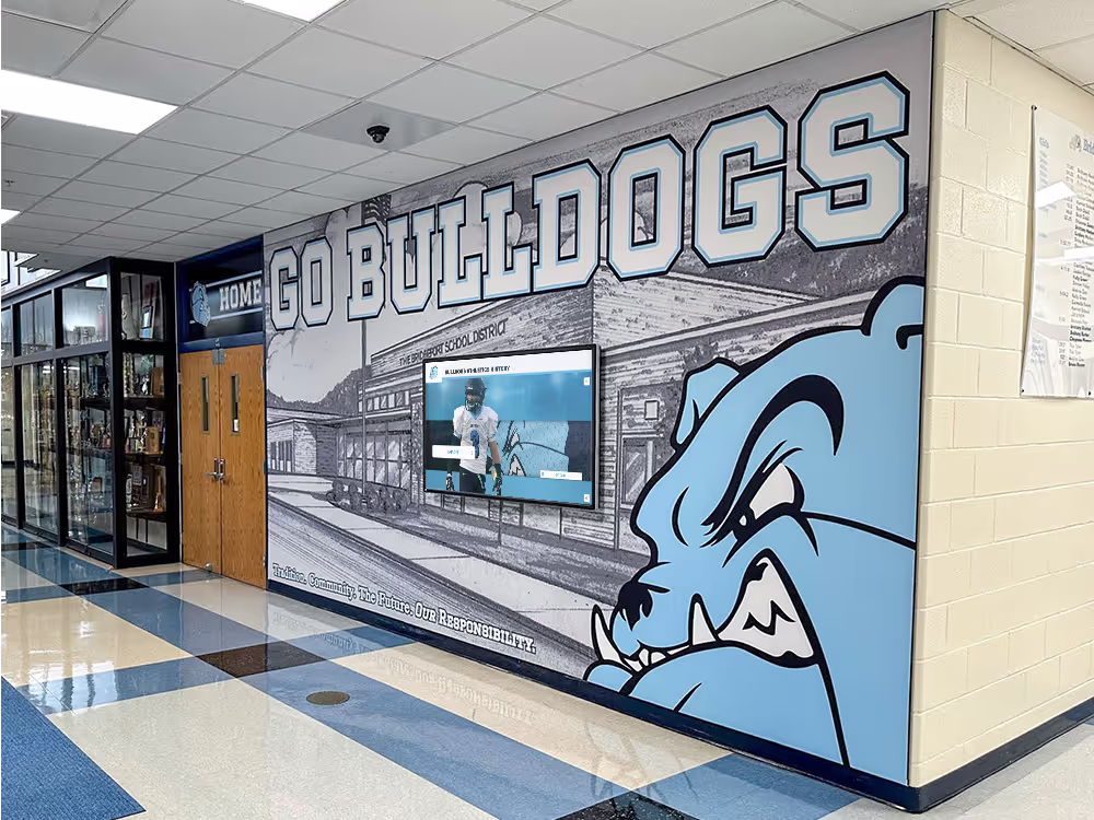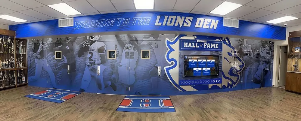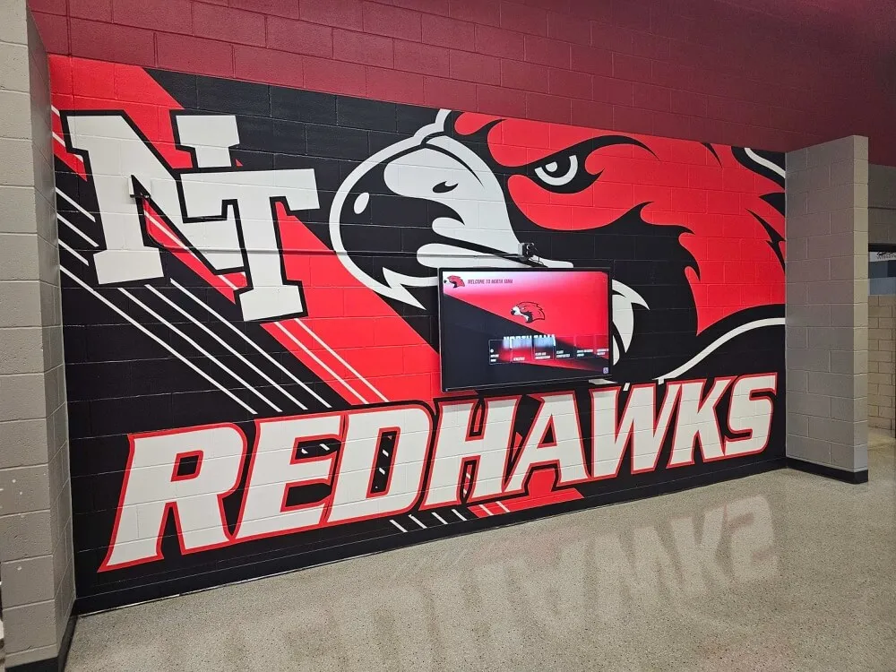
Walk into an athletic department that has intentional visual identity and you feel it before you read a word. The color palette is consistent from the entrance mural to the record boards in the gymnasium. The typography on the championship banners matches the font treatment on the hall of fame wall. The mascot lockup is the same one that appears on jerseys, on the website, and on every recognition display. That coherence is not accidental—it is the product of deliberate athletic department branding applied systematically across every surface.
Most athletic departments have the raw ingredients: official school colors, a mascot, a logo, decades of accumulated championships and records. What they often lack is a system that applies those elements consistently across every recognition asset. The result is a lobby where the vinyl record board uses one font, the trophy case plaques use another, the hall of fame wall photographs are wildly inconsistent in style, and the championship banners hanging from the rafters were each ordered from whichever vendor was cheapest that year. Every individual piece may be well-intentioned. The aggregate communicates something unintended: that the program approaches its own history without a plan.
Why Athletic Department Branding Is an Administrative Priority
Visual identity is not a design luxury—it is an operational lever. A cohesive athletic department brand influences how recruits experience your facilities on their first visit, how donors perceive program quality when they walk through the gymnasium before a major gift conversation, and how alumni feel when they return to find their records still honored on the wall. Understanding the full scope of athletic director responsibilities increasingly includes managing this visual layer of program identity—not just operations and eligibility, but the physical and digital spaces that communicate what the program values. Solutions like Rocket Alumni Solutions help athletic directors apply brand standards consistently across digital record boards, hall of fame displays, and recognition programs—without requiring a graphic designer on staff.
The Four Pillars of Athletic Visual Identity
Every cohesive athletic department brand rests on four elements that should be documented, shared with every stakeholder who touches recognition assets, and enforced consistently across physical and digital displays.
1. Color Palette
School colors seem straightforward until you try to get them to match across a vinyl decal, a painted wall, a printed banner, and a digital screen. Each medium renders color differently, and without documented specifications, every vendor makes a slightly different judgment call. The navy blue on this year’s championship banner may not match the navy on the five-year-old record board, and neither may match the school website’s header.
An effective athletic brand color palette includes three layers of documentation:
Primary colors with exact specifications. Document school colors in at minimum three formats: Pantone (for physical print and fabric), CMYK (for professional print production), and hex or RGB values (for digital displays and websites). The hex value #0033A0 and its Pantone equivalent may look identical on screen but produce visibly different results in print without explicit guidance.
Secondary and accent colors. Most schools have two primary colors but need supporting shades for design flexibility—darker and lighter variants of the primary palette, a neutral (typically white or black), and occasionally a defined accent for call-out elements on recognition displays. Document all of these rather than leaving vendors to improvise.
Application rules. Specify which colors belong on which elements. Record board panel backgrounds, athlete name typography, record values, and year notations should each have assigned colors from the palette. These rules prevent individual vendors or staff from creating combinations that technically use school colors but produce results that fight the brand rather than reinforce it.
2. Typography
Typography is among the most visible—and most frequently violated—elements of athletic department branding. A walk through many school athletic facilities reveals a typographic free-for-all: serif fonts on old trophies, bold condensed type on digital signs, hand-lettered record boards from the 1990s, and whatever default font the booster club used when it ordered the latest plaque. None of these choices were made maliciously. They were made in isolation, without a documented standard to reference.
A clear typographic system for athletic recognition addresses three levels:
A primary display font. Athletic programs typically use a bold, condensed typeface for headlines, record values, and primary recognition labels. The choice should reflect the athletic identity—assertive, legible at gymnasium distance, available in digital formats so it can be used consistently across both print and screen.
A secondary font for supporting information. Athlete names, years of achievement, sport labels, and descriptive text on hall of fame profiles require a more neutral, highly readable companion to the display font. This secondary typeface handles the detail layer that the display font cannot.
Specific hierarchy rules for record boards. Record boards are data-dense, and their typographic hierarchy must communicate clearly at distance. The record value—time, distance, score—should be the most visually dominant element. The athlete’s name follows at a secondary size. The year and event are tertiary. Documenting font sizes and weights for each tier ensures every sport’s board reads with the same visual logic.
Number formatting deserves its own line in the style guide. Define whether times display as MM:SS.ss or seconds only. Clarify how distances appear—feet and inches or metric, with or without fractions. Consistency in number formatting signals precision and care.
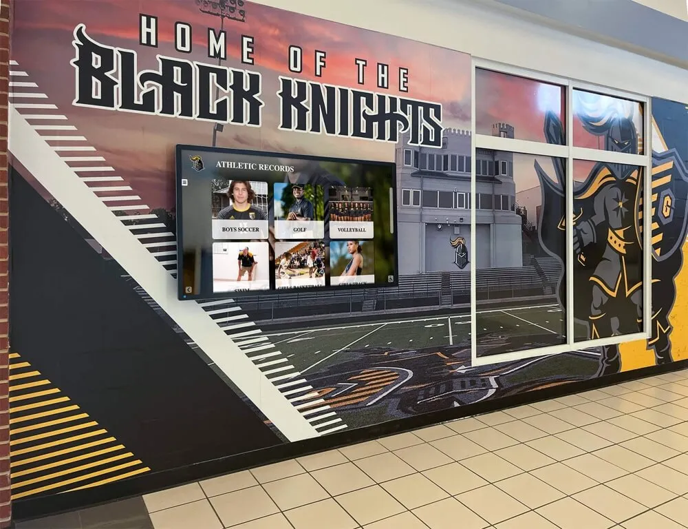
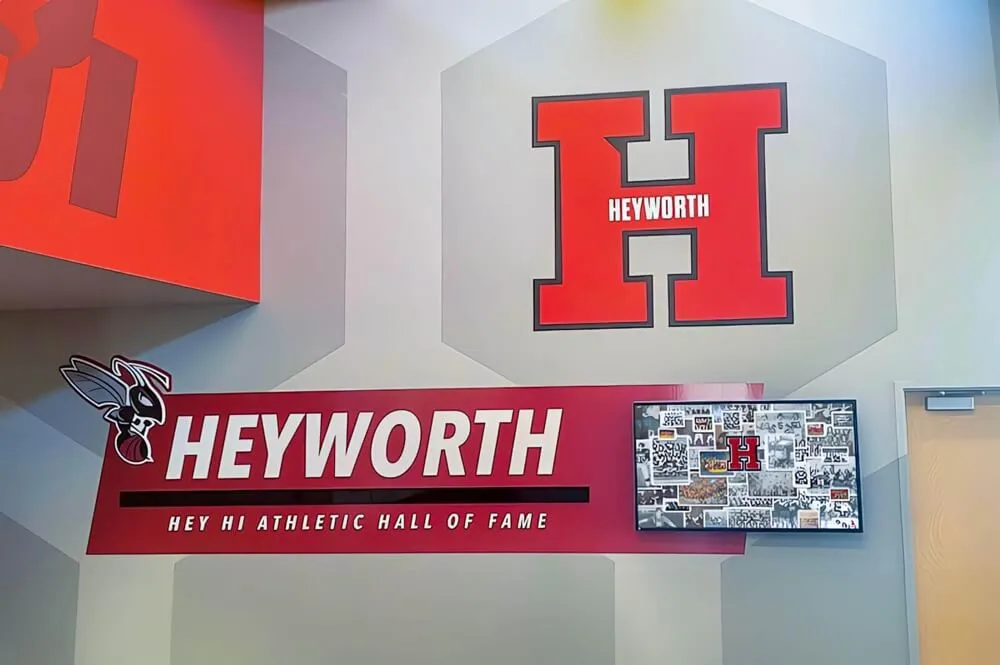
3. Mascot and Logo Usage
Most schools have multiple mascot variants—a full illustrated character, a simplified athletic mark or crest, a wordmark, and sometimes sport-specific lockups. The problem arises when these variants appear inconsistently, or when outdated versions remain on aging recognition displays while the current brand standard has evolved.
Thoughtful school mascot design has lasting implications for athletic recognition assets. A well-constructed mascot lockup should read clearly at the size of a display header just as it does on a jersey or a banner.
An athletic brand guide should specify:
- Which mascot variant is approved for each use case. Full illustrated character: murals, large-format entrance displays. Athletic mark or crest: record board headers, hall of fame wall headers, digital display nameplates. Wordmark: formal recognition contexts, plaques, certificates.
- Clear protection zones and minimum display sizes that prevent the logo from being overwhelmed by surrounding elements or reduced to an unreadable smudge.
- Available color versions: full color for standard use, single-color for engraving and embossing, reversed white for use on dark backgrounds.
4. Photography and Imagery Standards
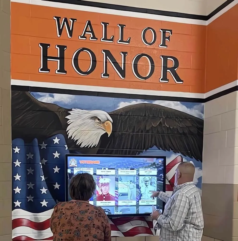
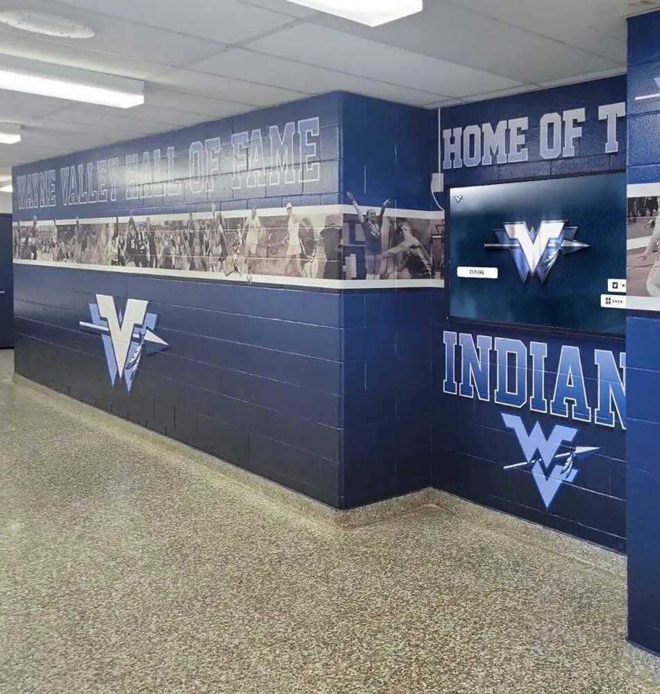
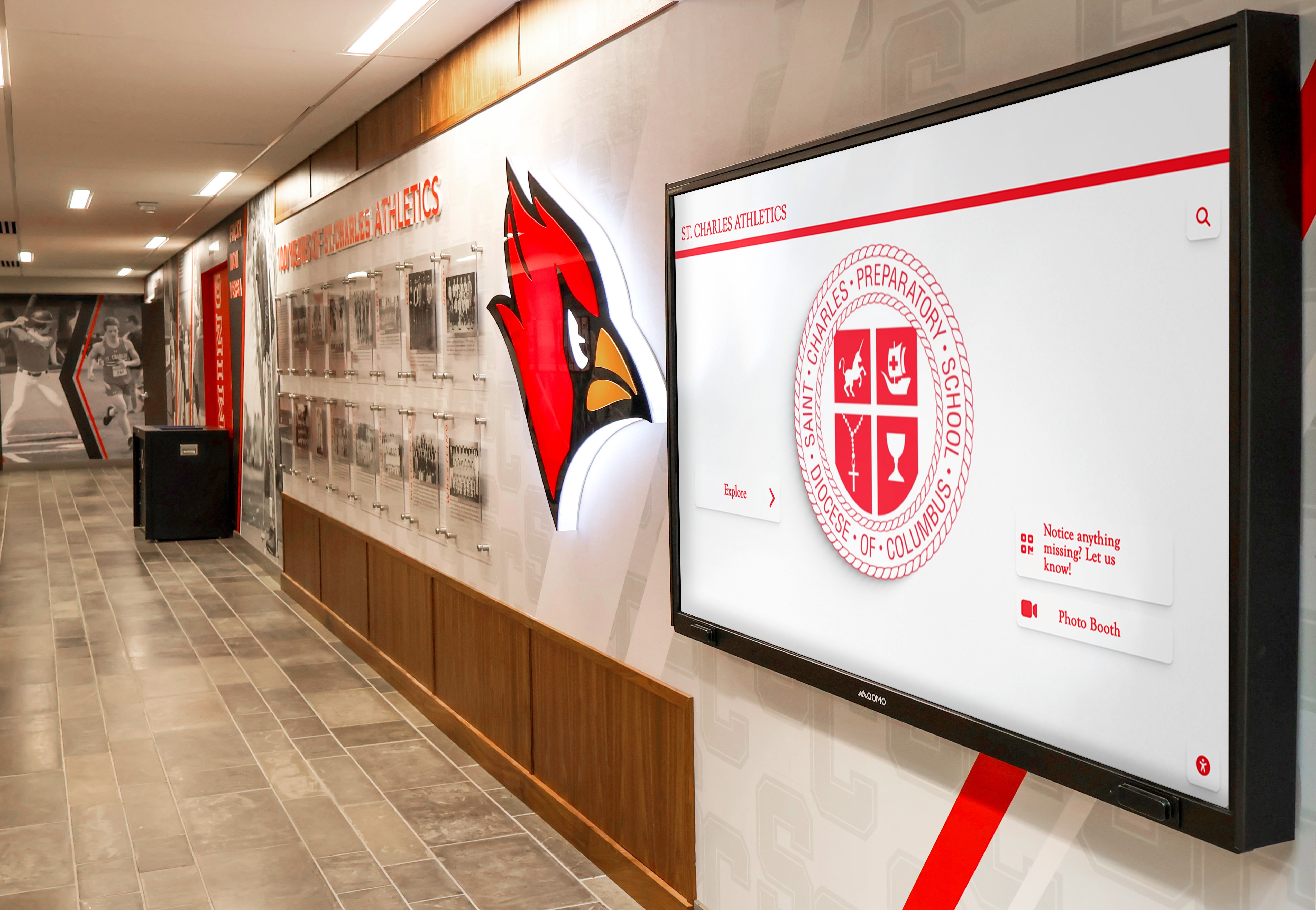
The hall of fame wall is where photography becomes the dominant visual element, and inconsistency here is conspicuous in a way that typographic inconsistency is not. A wall where one inductee has a professional headshot, the next has a grainy action photo scanned from a 1987 yearbook, and the third has a cropped team picture where two other athletes are partially visible does not project the credibility these individuals deserve.
Define a photography standard that covers:
Hall of fame profile photos. Establish a consistent crop—headshot or three-quarter portrait—a background treatment, and a policy for archival photos. Older black-and-white images may receive a specific treatment (grayscale with a color border frame, for example) that acknowledges their era while keeping them visually consistent with modern entries.
Team records and championship entries. Decide whether individual record entries carry athlete photos, and if so, what format those photos follow.
Archival integration. Many programs have decades of team and athlete photos shot under vastly different conditions. A consistent post-processing treatment—crop, color grade, border style—creates visual coherence even when source material quality varies widely.
Applying Brand Standards to Record Boards
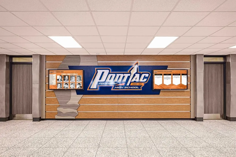
The athletic record board occupies a unique position in the visual identity system: it is simultaneously a data display and a recognition artifact, and it is often updated more frequently than any other element. Every new record entry is an opportunity to maintain the brand—or to let it drift.
Typography hierarchy for record boards. The record value should be set in the largest, boldest type on the board. The athlete’s name follows at a secondary size. The year and event are tertiary. Using the primary and secondary fonts from the athletic brand guide ensures the record board reads as part of the same visual family as the hall of fame wall and championship banners hanging in the same gymnasium.
Color application. School primary colors should appear in the background, border treatment, or panel header. Record values and names use the high-contrast color that makes them readable at gymnasium distance. Off-brand color choices—navy blue on a program whose colors are purple and gold—break visual coherence instantly, especially when the board sits in the same field of view as on-brand murals or banners.
Format consistency across sports. A 20-sport athletic department whose record boards span swimming, track, basketball, wrestling, and a dozen other programs needs those boards to look like they belong to the same visual family. Consistent panel dimensions, consistent header treatment, and consistent font and color use makes the facility feel like a unified athletic identity rather than a collection of independent vendor projects.
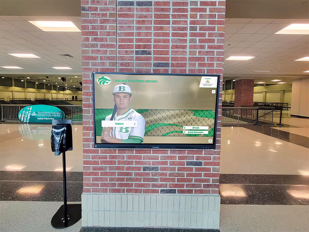
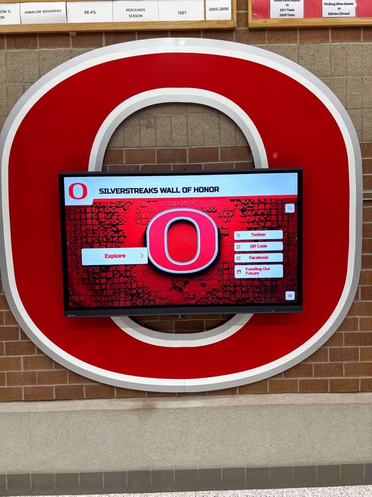
The formatting limitations of traditional vinyl and engraved record boards make consistent visual identity difficult to maintain over time. As letter sizes change across vendors, as available space fills up, as typographic preferences shift between eras, the board drifts visually from its original standard. A digital record board solves this structurally: design standards are part of the system template, and every new record entered—automatically ranked, automatically displayed—uses the same format as every previous one.
| Legacy Record Board | Digital Record Board |
|---|---|
| Typography set by vendor at print time | Consistent font, size, and hierarchy enforced by template |
| Colors vary by print run or engraving shop | Exact hex values applied identically across every entry |
| Manual updates required when records fall | Auto-ranking updates instantly when new marks are entered |
| No mascot or logo update capability | Logo, colors, and layout updated once and deployed everywhere |
| Finite physical space limits entries shown | Unlimited entries with searchable all-time history |
| Brand drift accumulates with each update cycle | Template locks brand standards permanently |
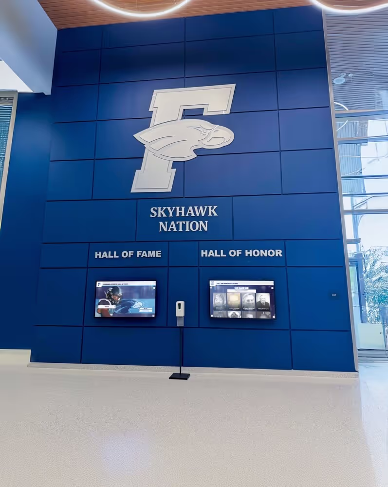
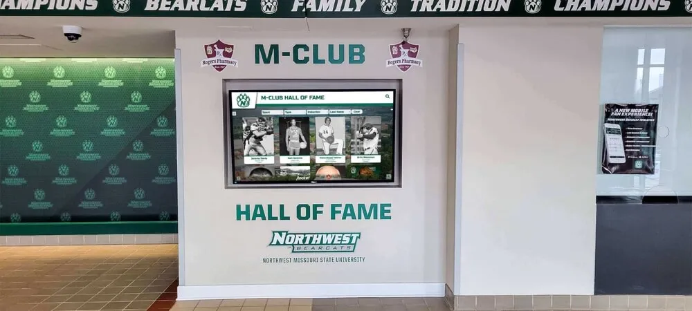
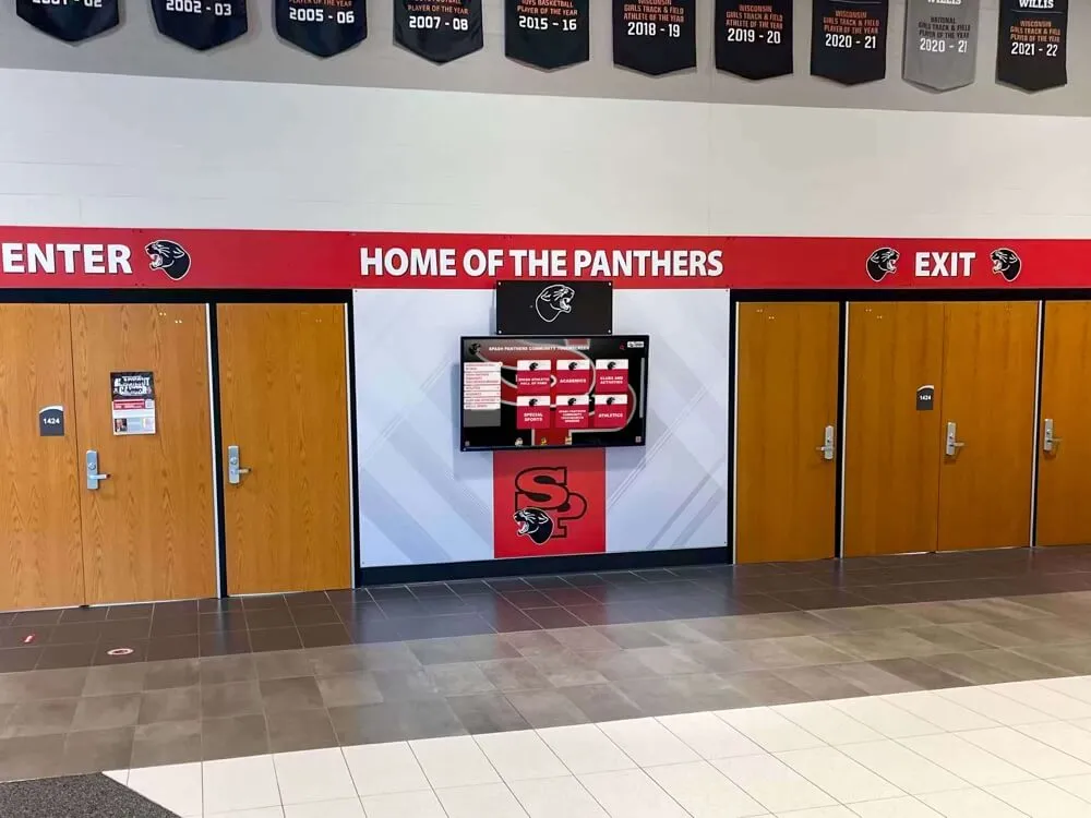
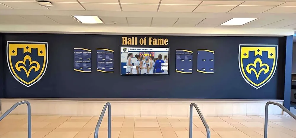
Applying Brand Standards to Hall of Fame Walls
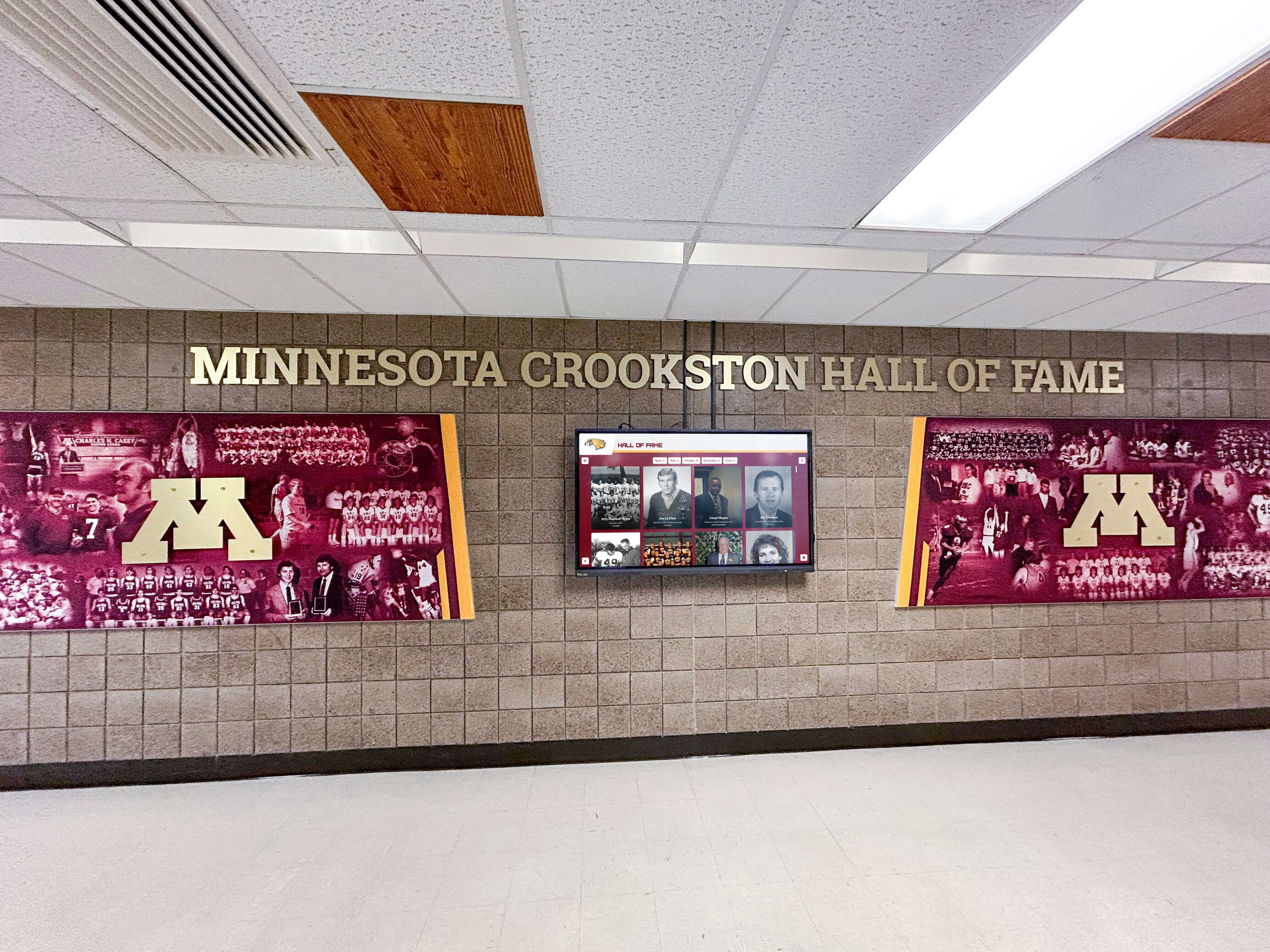
The hall of fame wall receives more scrutiny from alumni, donors, and recruits than any other display in an athletic facility. Recruits walk through the hall to understand what the program values and who it honors. Alumni return expecting to find themselves represented with the dignity their careers earned. Donors evaluate the facility’s quality before making major gift decisions.
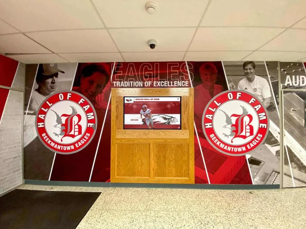
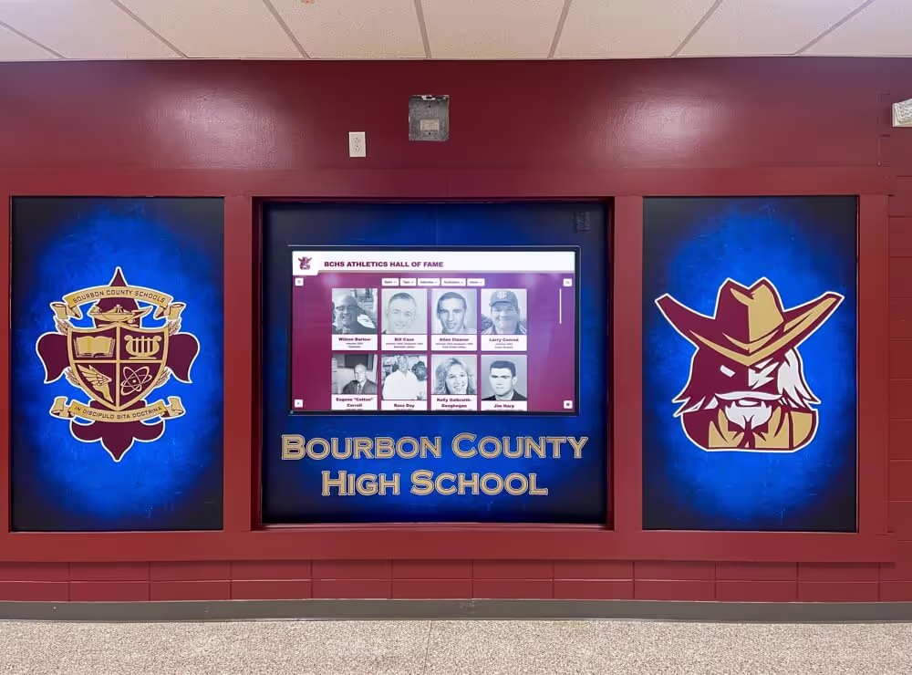
A well-branded high school wall of fame applies athletic brand standards to every profile card: consistent photo treatment, consistent typography for name and sport, consistent use of school colors in the card design, and consistent sizing so inductees from different decades receive the same visual treatment.
Profile card template. Design a standard profile card that specifies photo crop and size, name typography (font, weight, size, color), sport and year inducted typography, any biographical text formatting, and color blocking drawn from the school’s primary palette. Once this template exists, adding a new inductee requires slotting in their content—not designing from scratch.
Section organization. Large halls of fame benefit from section headers or dividers distinguishing sport categories or induction decades. These headers should use the same typographic and color standards as the individual profile cards, reinforcing rather than interrupting the visual system.
Physical display translation. Wall-mounted plaques, framed portraits, and display cases each require adapting brand standards to the physical medium. Document how colors translate in each format—paint finish, vinyl decal, or printed substrate—and how typography is reproduced, whether laser-engraved, vinyl-lettered, or digitally printed.

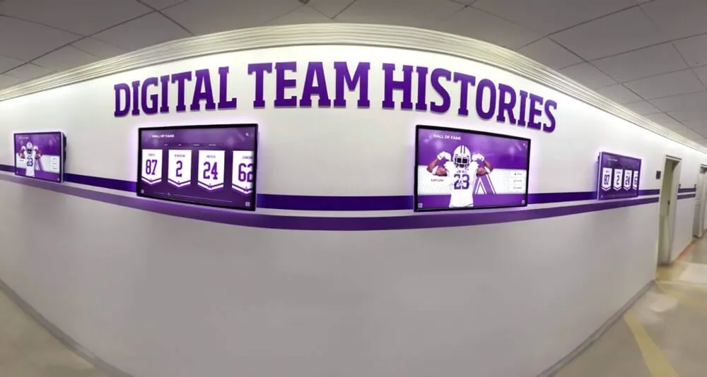
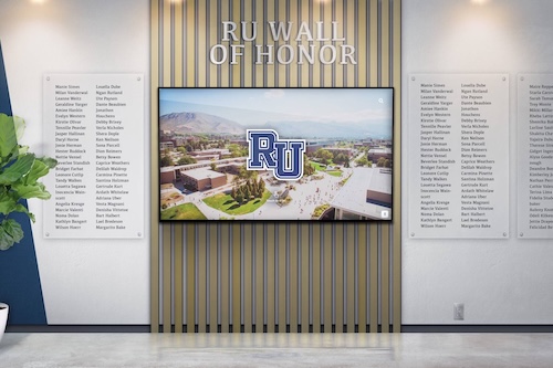
The move to digital hall of fame displays resolves many of the brand consistency challenges inherent in physical walls. A digital system applies the approved template to every inductee profile automatically, ensures photo treatment is consistent regardless of source material age, and allows real-time updates when branding elements change—without reprinting or repainting anything.
Applying Brand Standards to Championship Banners and Recognition Programs
Championship banners present a branding challenge that most athletic directors encounter every few years: each new championship is an opportunity to maintain visual standards or to let a vendor’s default template dictate the result.
A consistent championship banner program establishes a template that specifies the school logo lockup and placement, sport name typography and size, championship type and year, and overall dimensions. When the 2019 banner, the 2023 banner, and the 2026 banner all follow the same template, the gymnasium rafters communicate program consistency and pride. When each banner came from a different vendor using their own template, the rafters communicate the opposite.
Recognition event materials. End-of-season banquets, senior nights, and award ceremonies produce printed or projected materials—award plaques, certificate designs, slide presentations—that are often created quickly, outside the normal athletic communications workflow. These materials should reference the athletic brand style guide rather than starting from scratch. A certificate printed with the wrong font or an off-brand color palette undermines the significance of the award it confers.

Trophy case and display case presentation. The athletic trophy case is often the first recognition asset visible to anyone entering an athletic facility. Branded signage within the case, consistent shelf labeling typography, and color-coordinated backdrops bring the same visual coherence to this format that a well-designed hall of fame wall achieves.
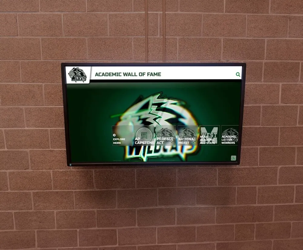
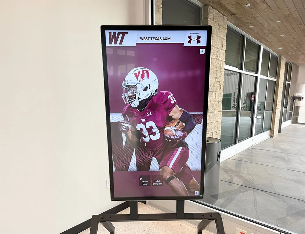
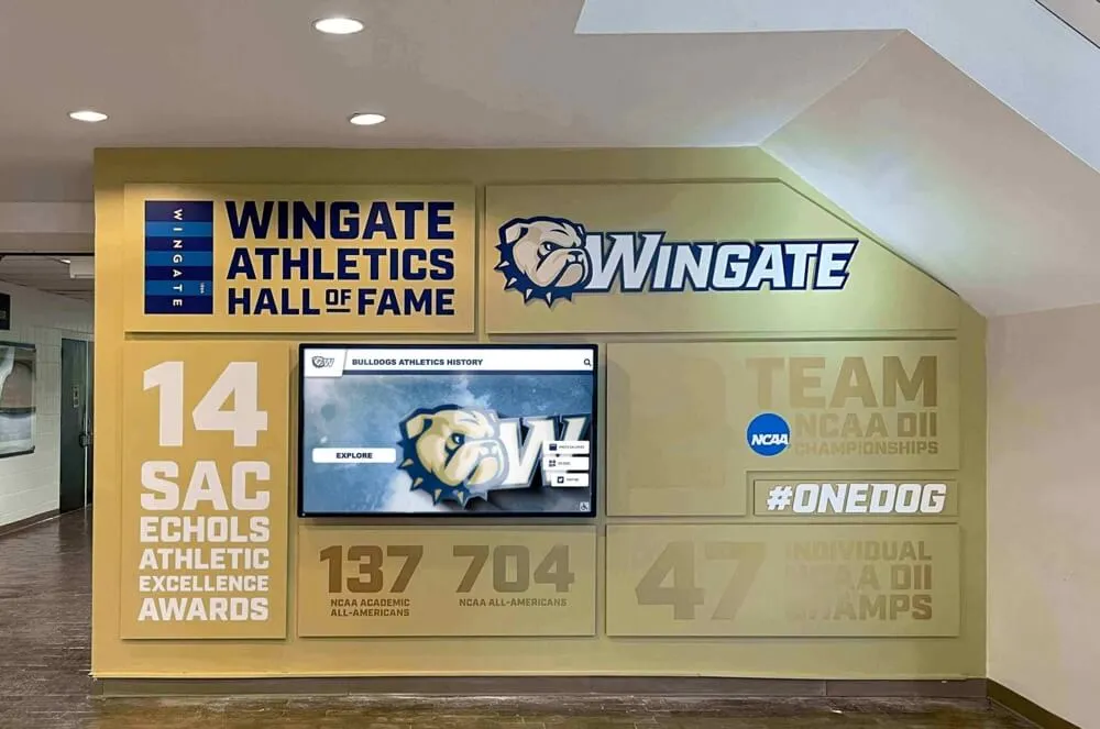
Digital Recognition: Brand Enforcement at Scale
The practical challenge with maintaining brand standards across physical recognition assets is that every vendor, every print run, and every staff member who creates a display introduces potential for deviation. A new booster club president orders the plaques. A different vendor prints the banners. A coach updates the record board with handwritten tape over the old lettering. Each decision feels minor. Over time, the cumulative effect is a facility that looks like it was designed by committee—because it was.
Digital recognition displays for athletic departments work from a template system: colors, fonts, layout rules, and logo placement are defined once in the platform configuration and applied consistently across every record entry, every inductee profile, and every championship display. When the school updates its official logo or adopts a revised brand color specification, the update propagates across every display in the system simultaneously.
This consistency has operational advantages that extend beyond aesthetics:
Scalability without proportional staff cost. A 20-sport athletic department with record boards for each sport, a combined hall of fame, and championship displays across multiple venues cannot maintain manual brand consistency without dedicated staff. Digital systems scale brand enforcement automatically—the template does the work that would otherwise require ongoing vigilance.
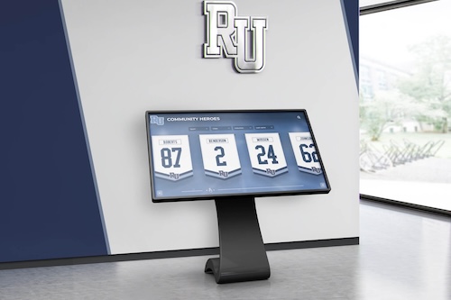
Remote content management. Managing content across touchscreen displays from a central administrative interface means that a logo update, a new color specification, or a layout adjustment happens once and deploys to every connected display simultaneously. The athletic director does not need to coordinate with multiple vendors or physically update each display location.
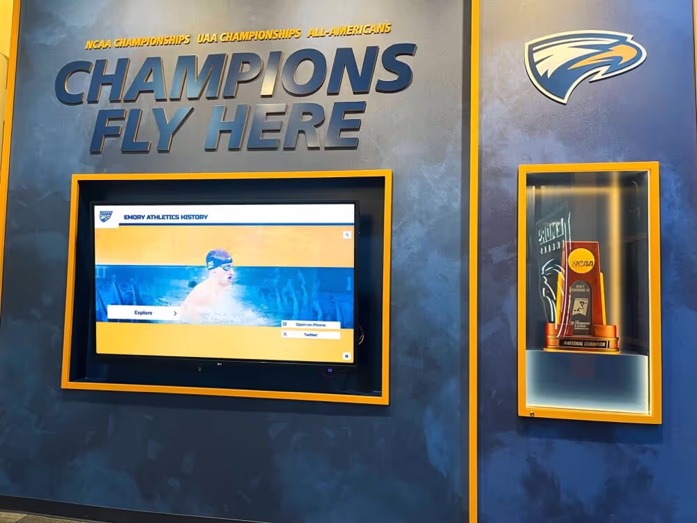
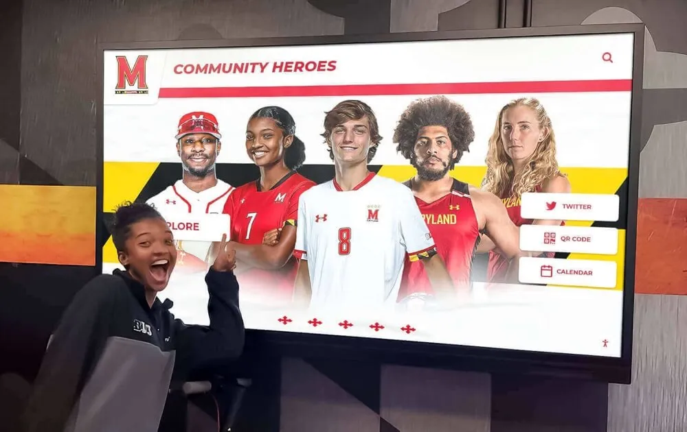
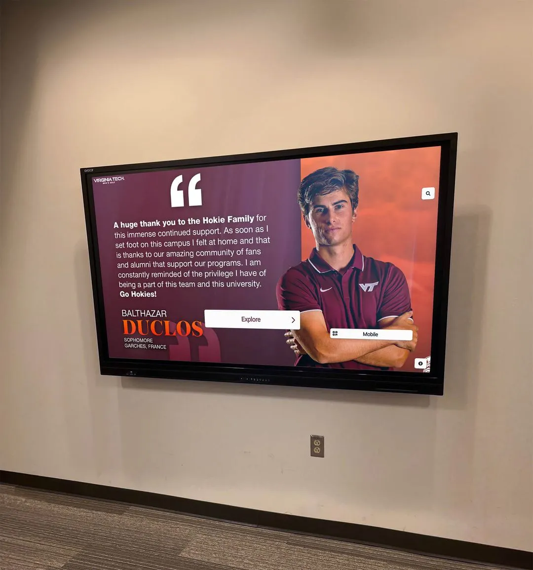
Multimedia brand expression. Digital recognition platforms support video, photography, and animation in ways that physical boards cannot. This enables a richer athletic brand expression—video highlights associated with record entries, animated mascot elements, audio content for hall of fame profiles—while maintaining the template-driven consistency that enforces brand standards across every entry.
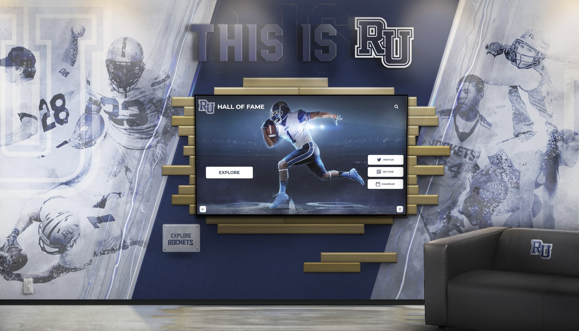
The best touchscreen hall of fame platforms available today combine brand-consistent display templates with auto-updating record systems and multimedia profile capabilities—delivering a recognition experience that honors both individual athletes and the visual identity of the program they represented. The branding is not an add-on. It is built into the system architecture.
Building an Athletic Brand Style Guide: A Practical Framework
The most actionable step an athletic director can take toward consistent athletic department branding is creating a one- to two-page style guide that documents the decisions above. This document does not require a professional designer to produce. It requires gathering existing assets and making explicit the choices that are typically left implicit.
Step 1: Gather source assets. Collect the official school logo files—vector formats preferred—Pantone or hex values for school colors from the communications or marketing office, any existing typeface licenses, and your athletic department’s specific logo lockup if distinct from the institutional mark.
Step 2: Document four foundational decisions. Write down the exact color values in Pantone, CMYK, and hex. Name the fonts and weights for display and body text on recognition assets. List the approved logo variants and their specific use cases. Describe the photography treatment standard for hall of fame profiles.
Step 3: Distribute and reference the guide. Share it with every vendor who produces athletic recognition assets: vinyl fabricators, trophy companies, banner printers, and digital display providers. Reference it explicitly in any purchase order for branded recognition materials. Vendors who receive a clear spec produce work that matches; vendors left to improvise produce work that doesn’t.
Step 4: Review annually. Athletic branding evolves alongside the school’s broader institutional identity. A single annual review—typically aligned with the spring athletic planning cycle—ensures the style guide stays current and captures any changes: an updated mascot, a new sport added to the program, a facility renovation that changes the display context.
A cohesive athletic facility makes every recognition asset work harder. When the record board, the hall of fame wall, the championship banners, and the trophy case all speak the same visual language, the cumulative effect communicates something beyond any individual achievement: it communicates that this program takes its history seriously enough to present it with care.
The welcoming foyer and lobby experience that recruits, donors, and returning alumni walk through is built on exactly this foundation—consistent visual identity applied intentionally across every recognition surface, from the entrance mural to the record board at the far end of the gymnasium.
Ready to apply your athletic department brand standards to digital record boards and hall of fame displays that enforce visual identity automatically? Rocket Alumni Solutions builds custom-branded interactive recognition displays for high school and college athletic departments—school colors, logo lockup, typography, and mascot integration delivered through a template-driven system that maintains brand consistency across every record, every inductee, and every championship entry. Schedule a demo to see how your athletic brand standards translate to a digital recognition wall that updates automatically and preserves every achievement your program has earned.